bachelor
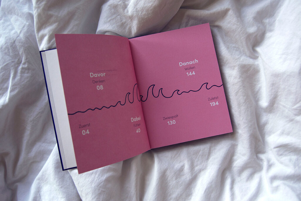
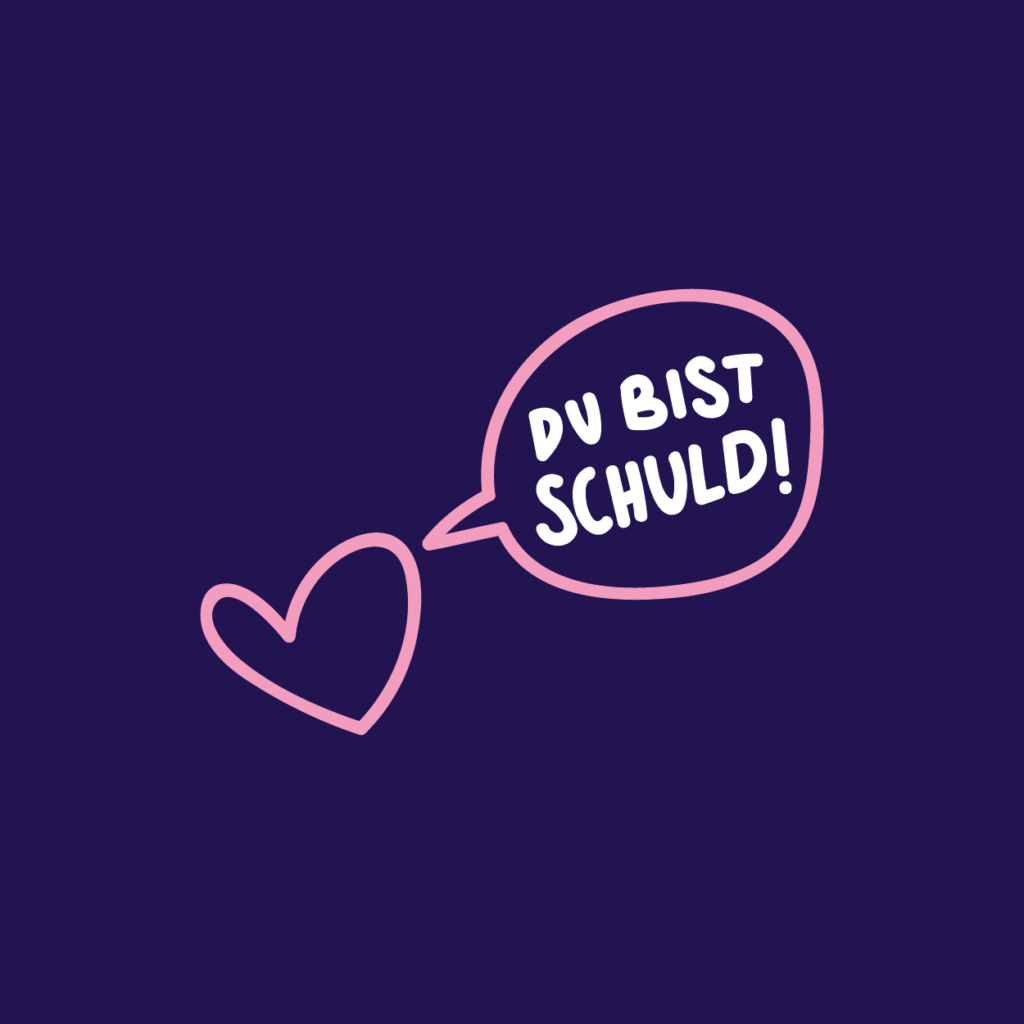
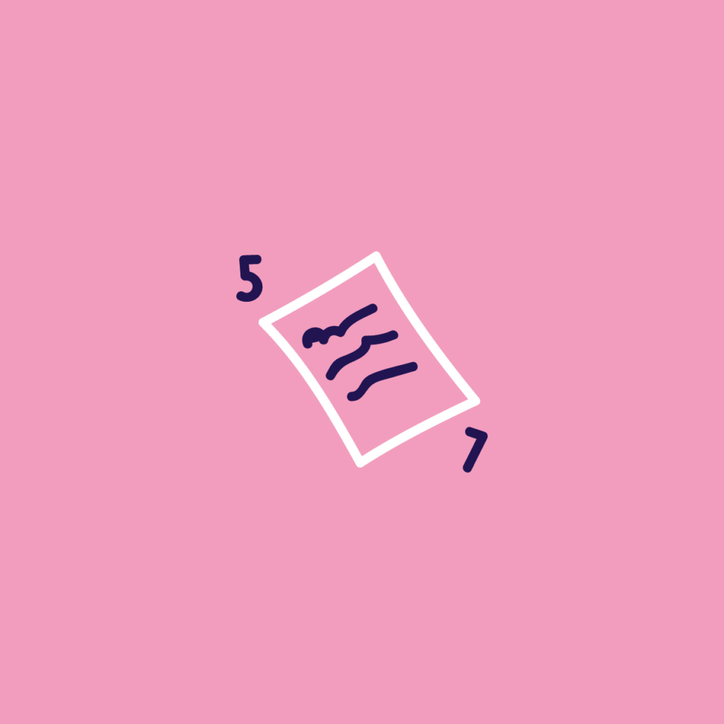
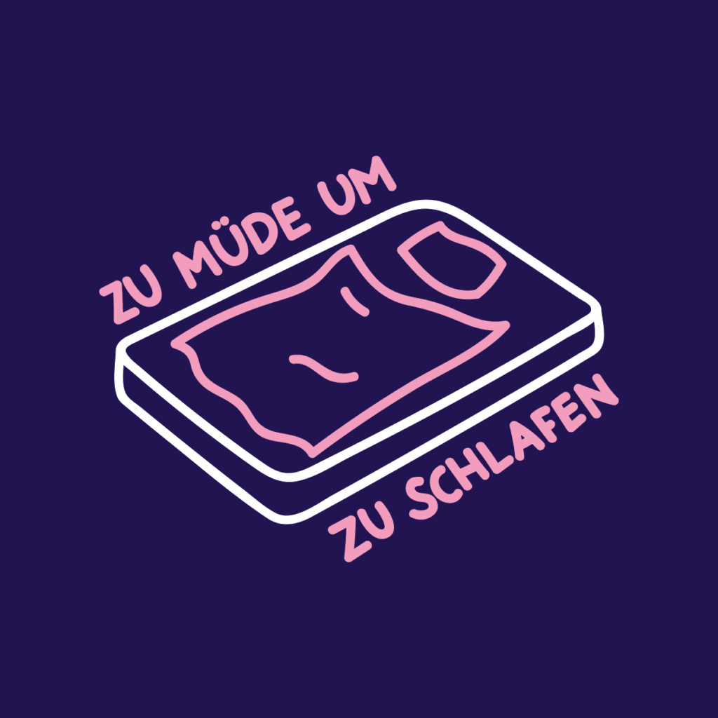
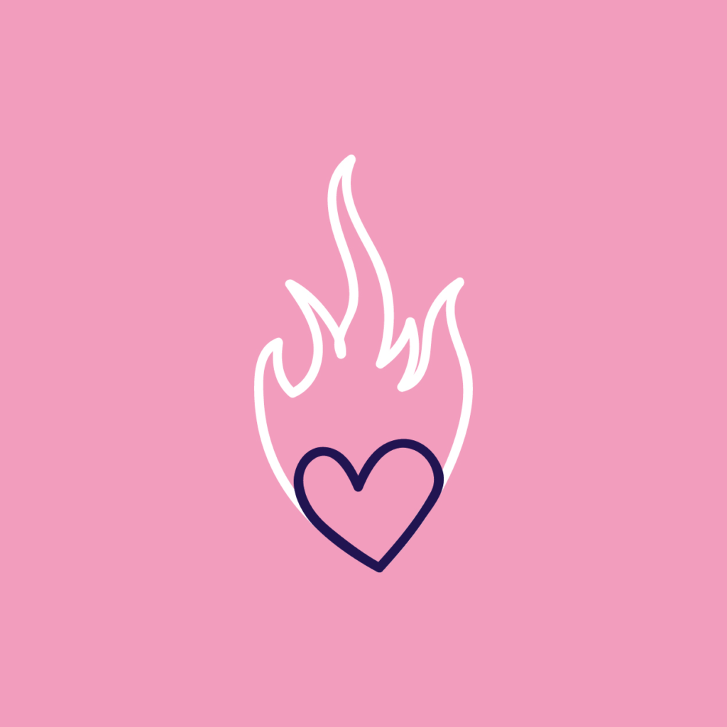
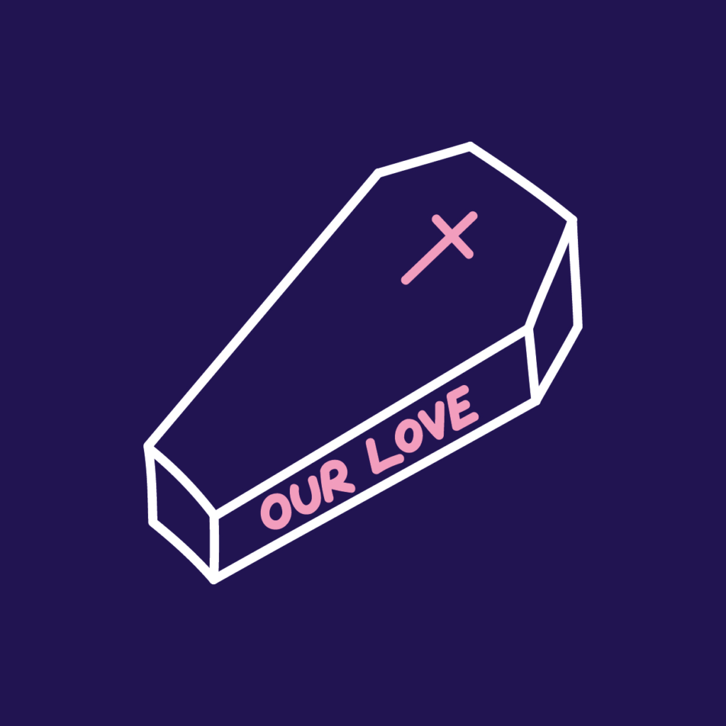
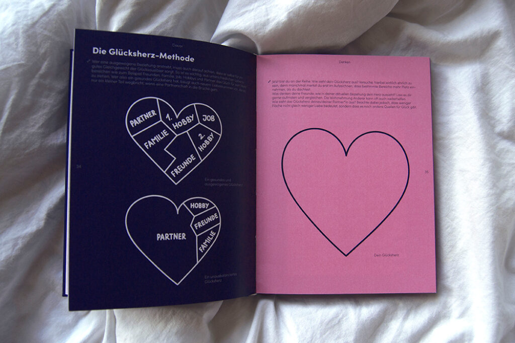
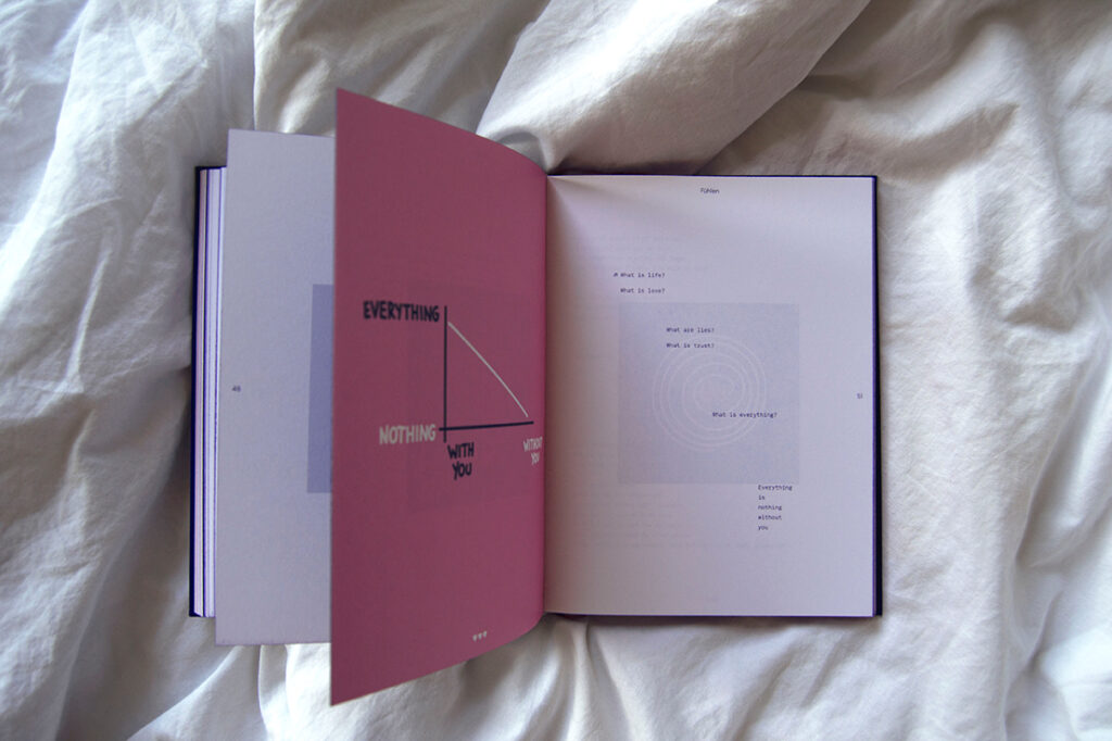
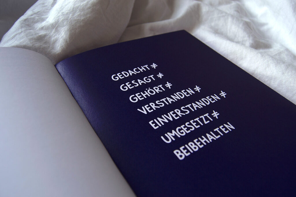
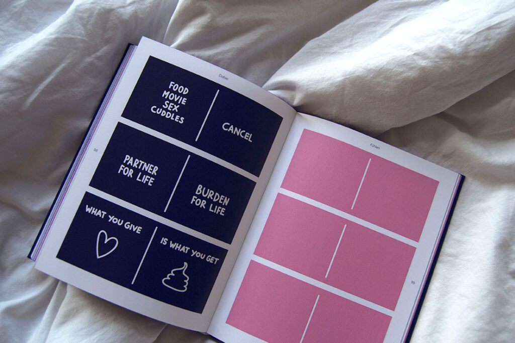
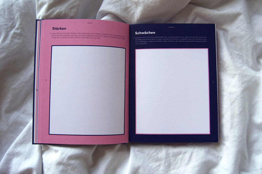
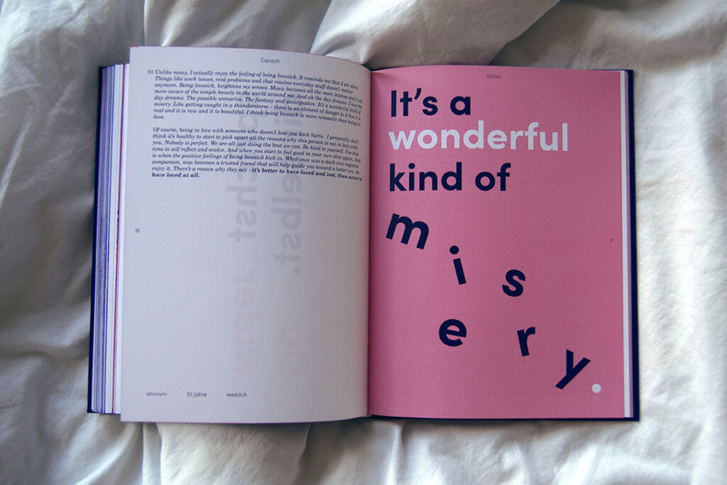
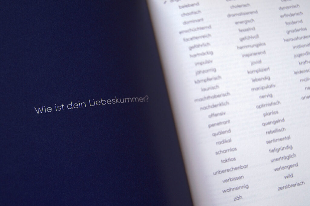
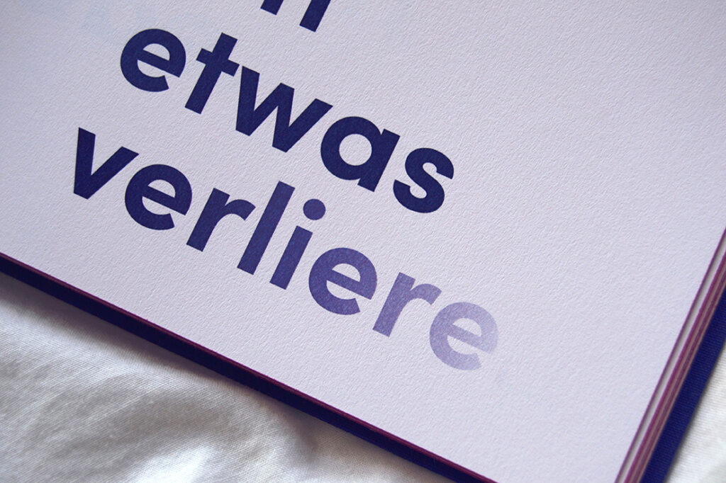
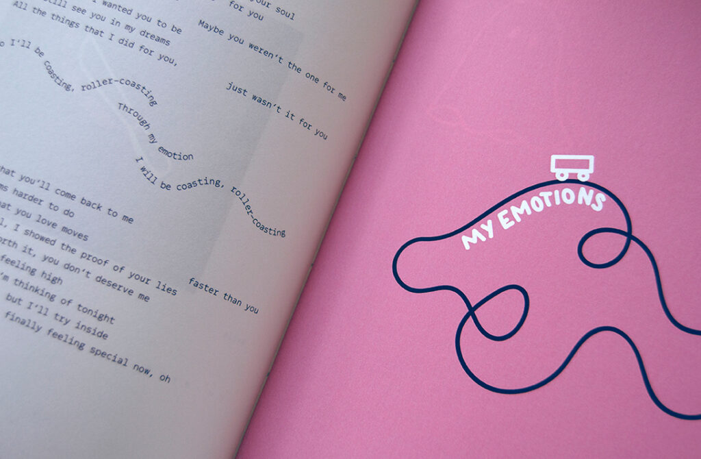
liebe gegen kummer (love against sorrow) is a book, that not only helps you to get over lovesickness but also tries to prevent you from losing yourself in a relationship. this bachelor project started from my own coping process into this whole book of methods, tips, illustrations and sensitive words.
the first chapter focuses on thinking (your brain) and helps you to figure out who you are, what you want your partner to be like and how your relationship should look like.
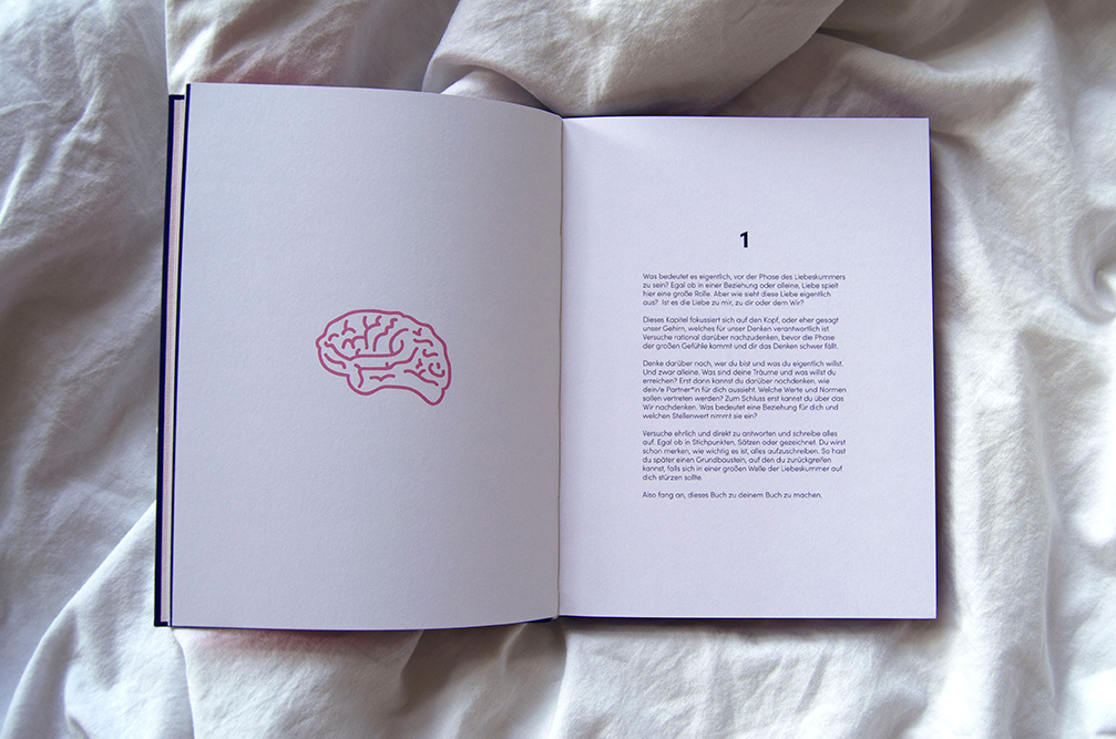
in the second chapter it is time to feel (your heart) and let it all out. a collection of song lyrics and poems with little illustrations help you to understand and find words for your feelings.
in the last chapter you have to ask yourself what you really want (gut feeling). i asked around how people felt about lovesickness and how they coped with it. some personal letters addressed to lovesickness show that you are not alone and that it will always get better.
app design
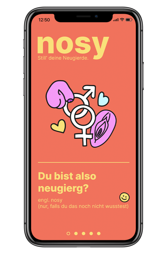
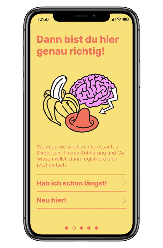
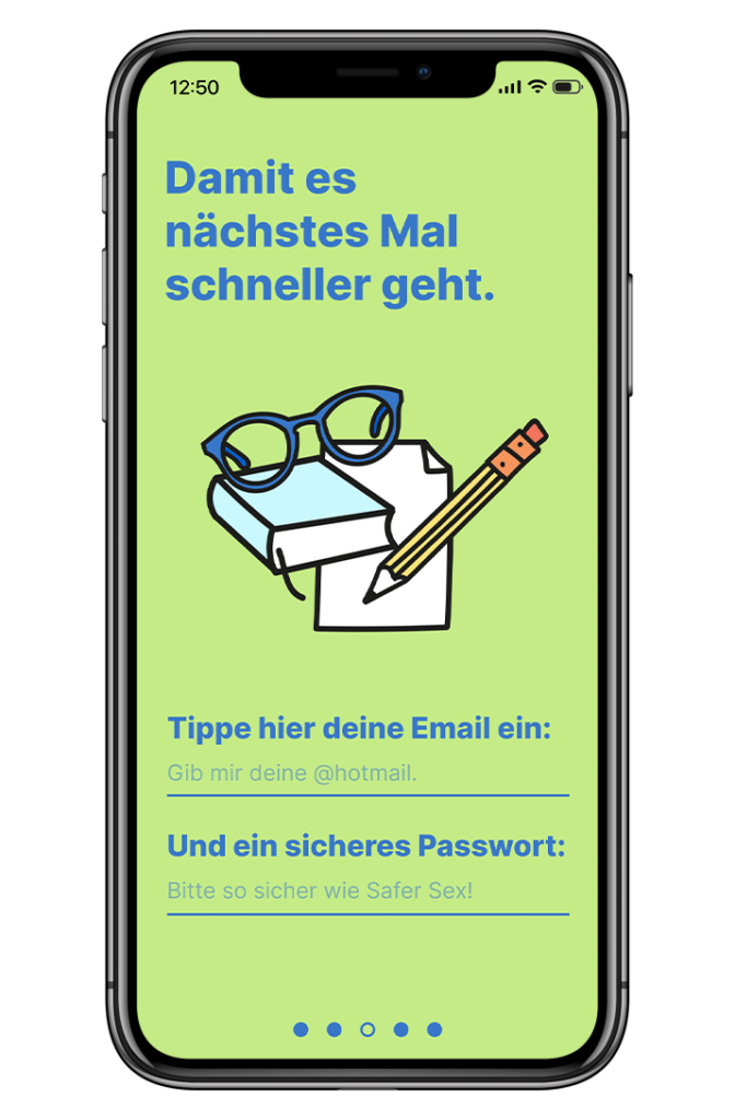
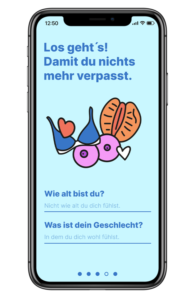
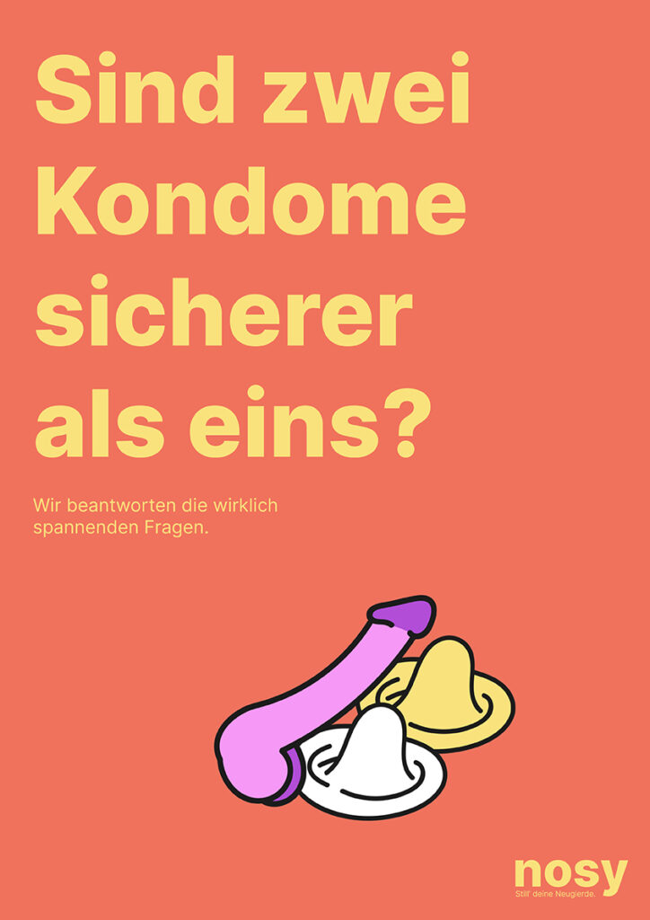
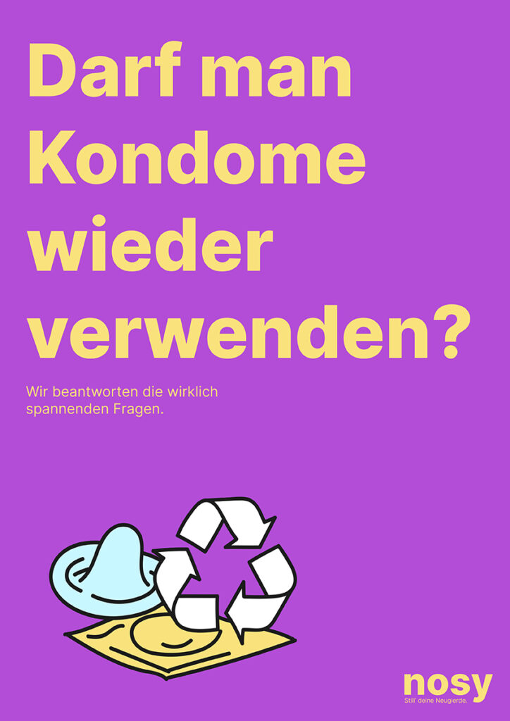
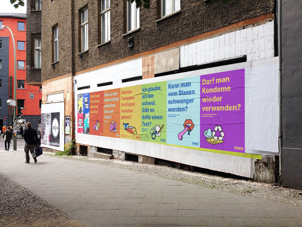
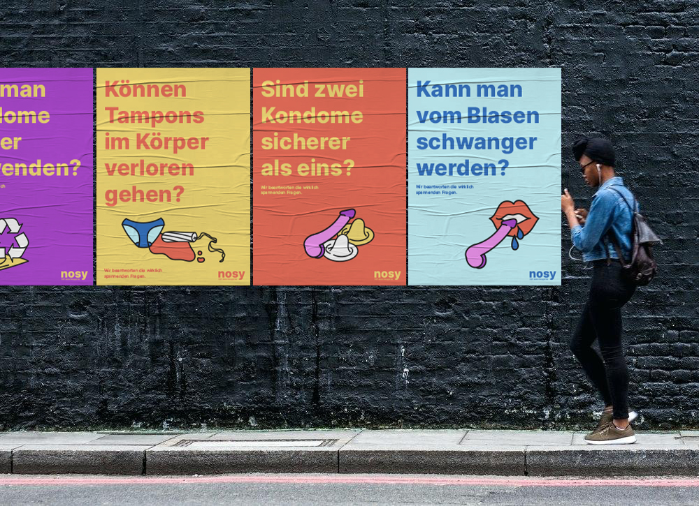
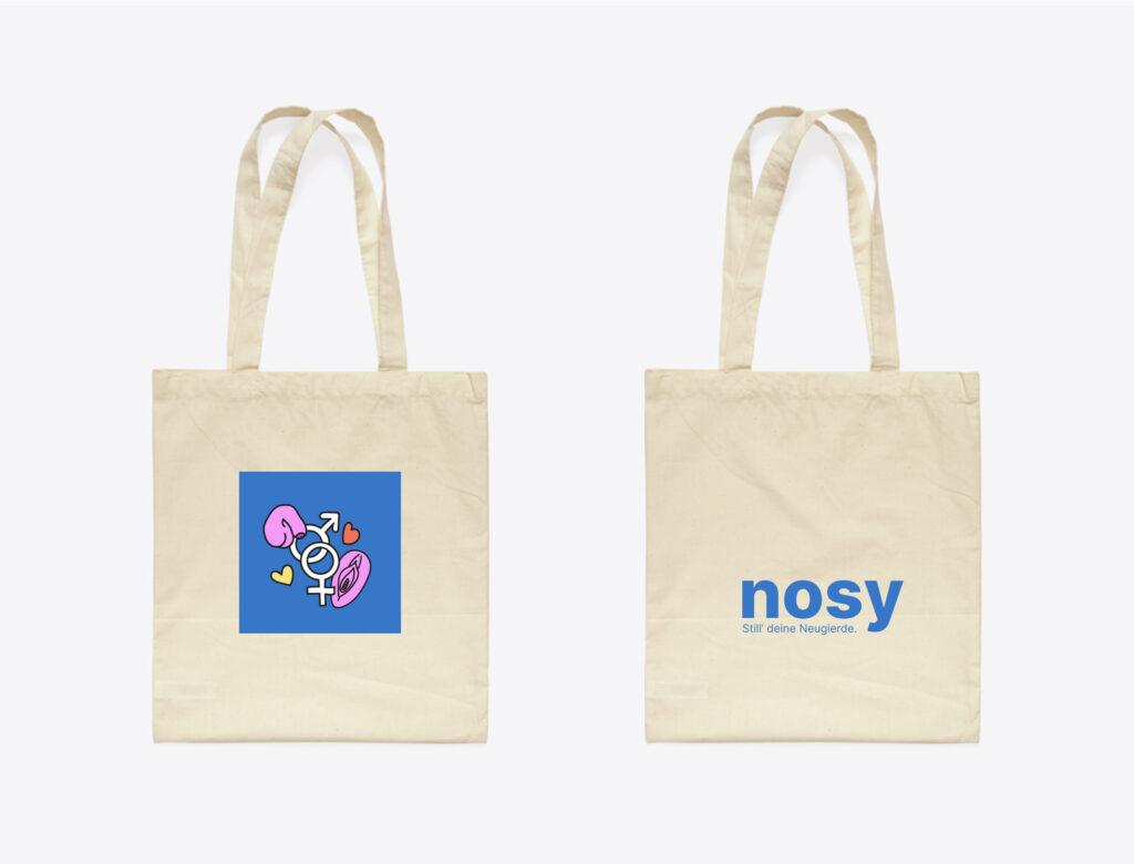
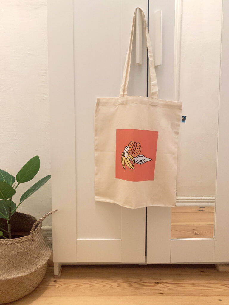
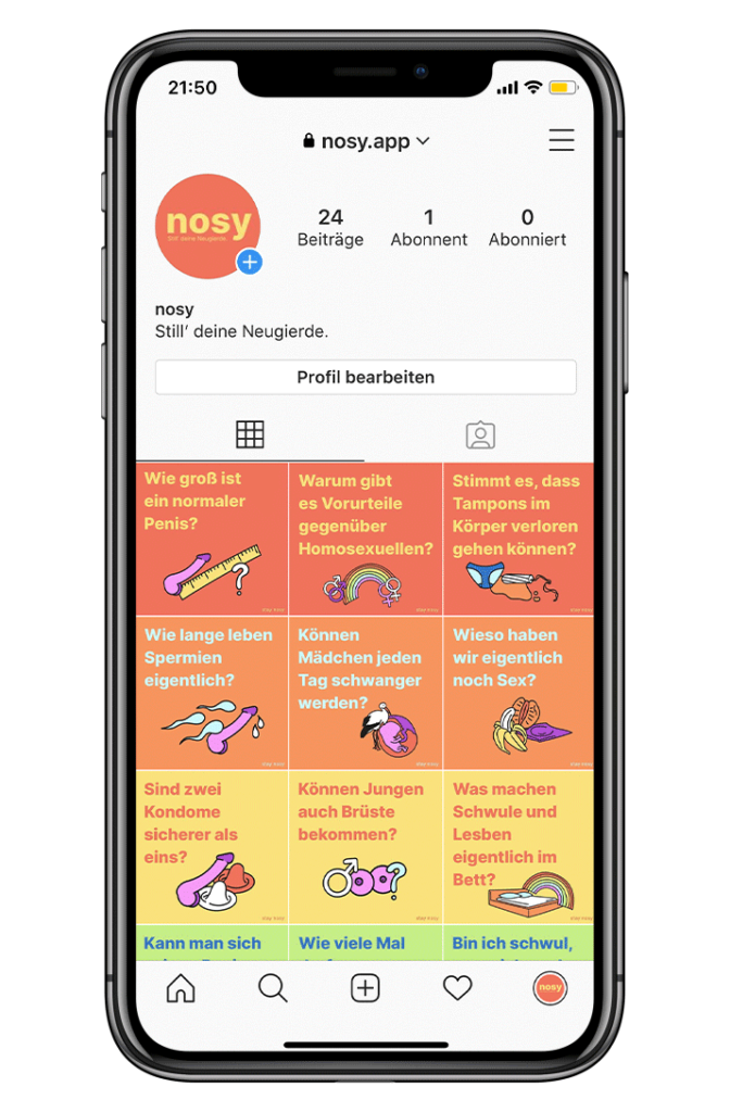
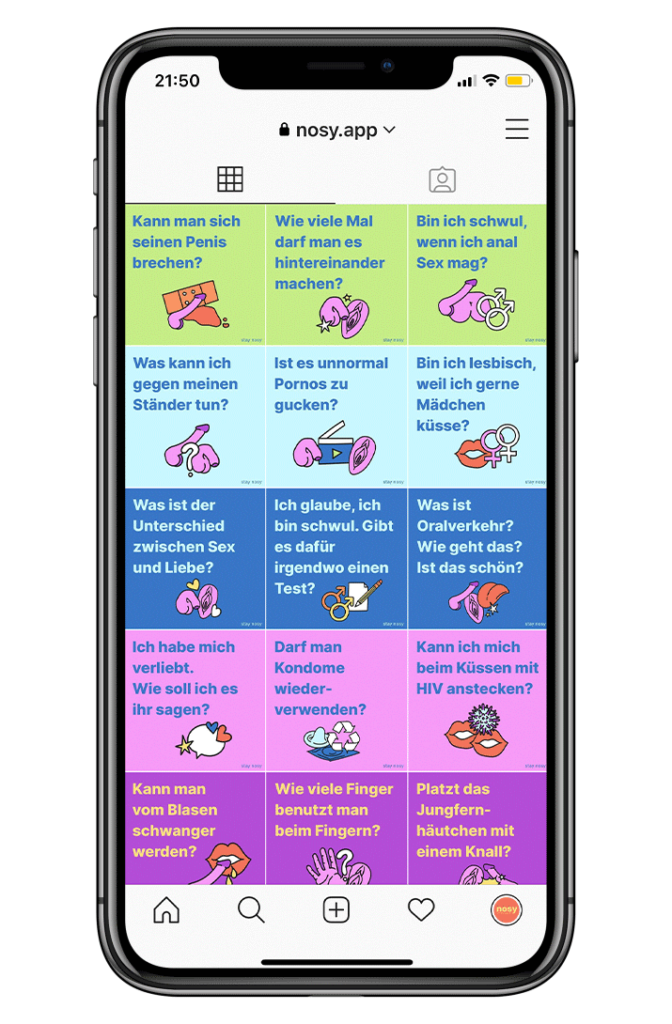
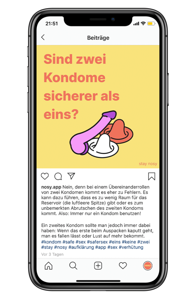
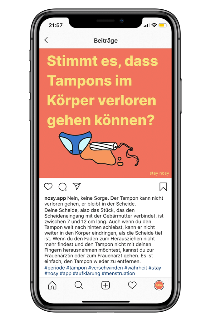
are you nosy? i bet you are cause let’s be honest who isn’t? this app is designed for all the young nosy people who always wondered if two condoms are really safer than one. it not only provides the user with age-appropriate knowledge about sexual education but also answers questions and takes away insecurities about any subject related to sexuality.
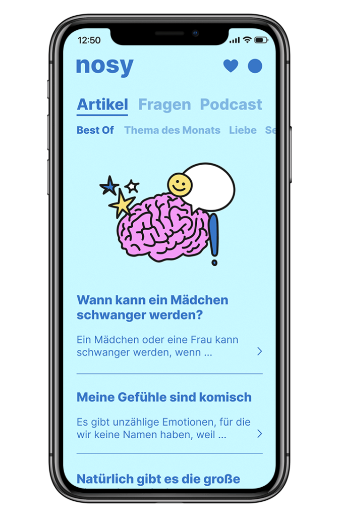
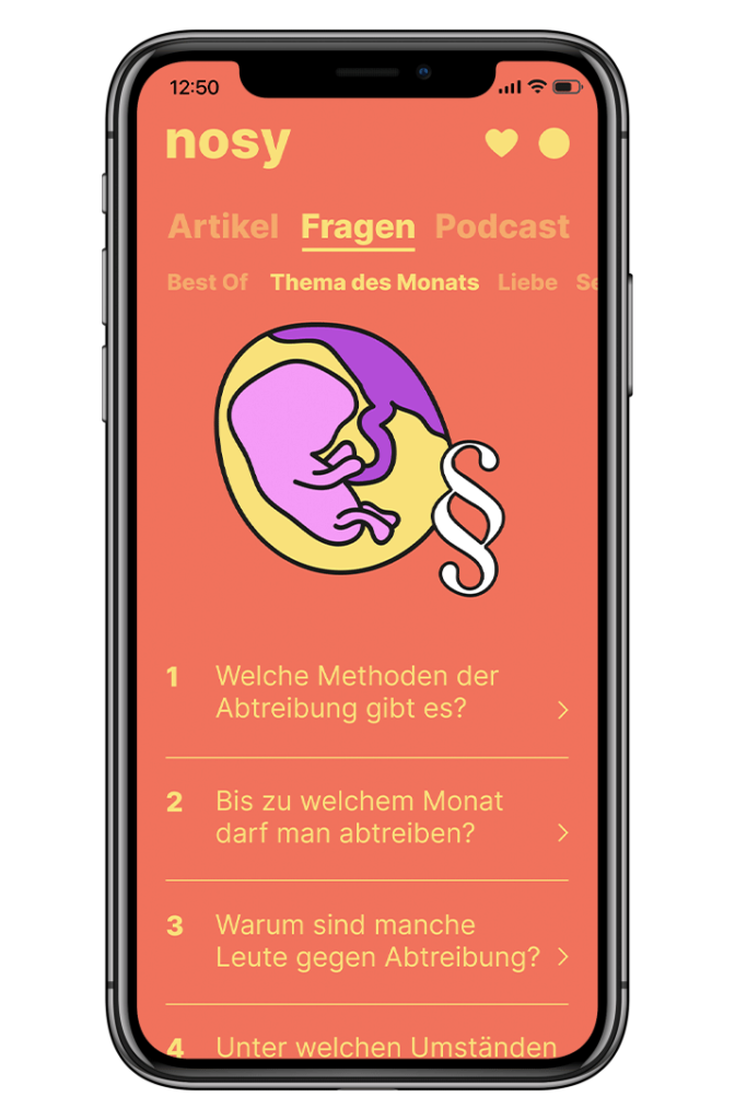
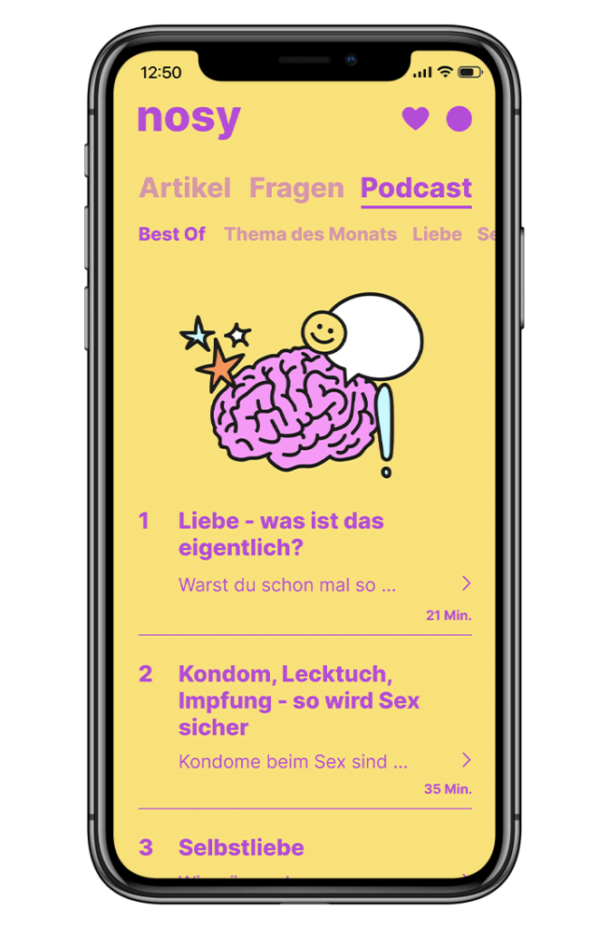
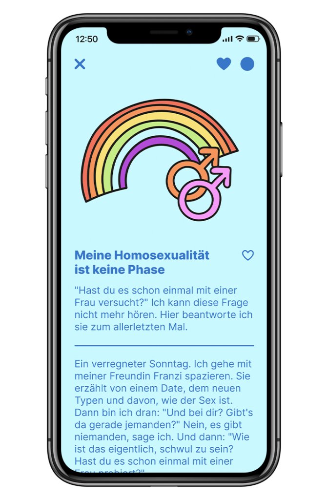
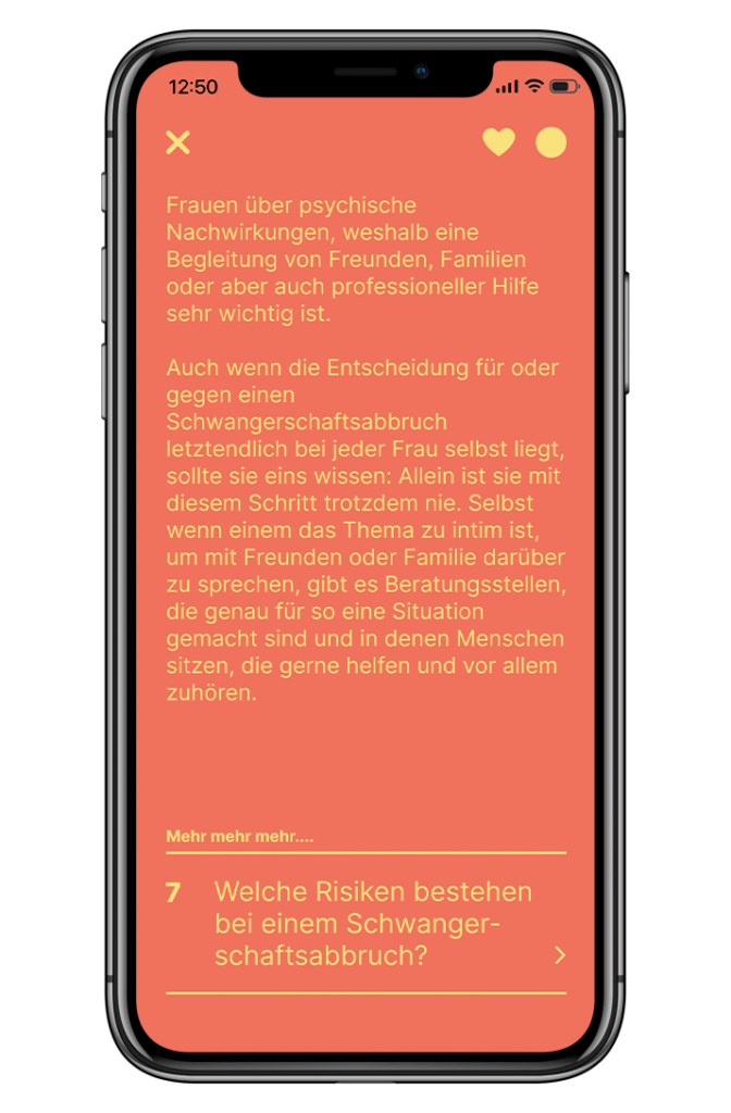
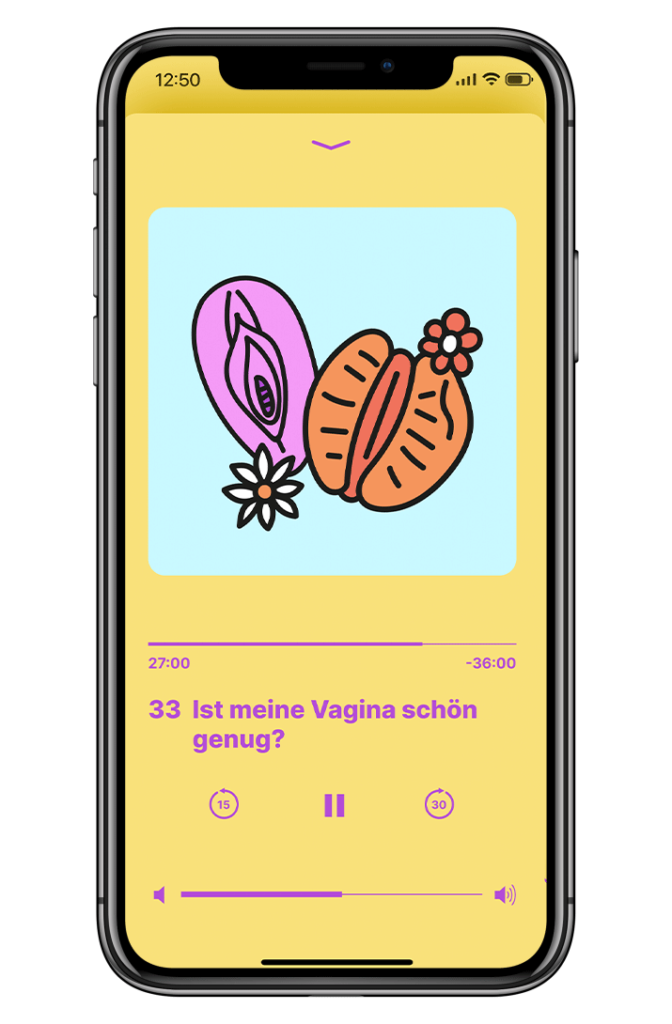
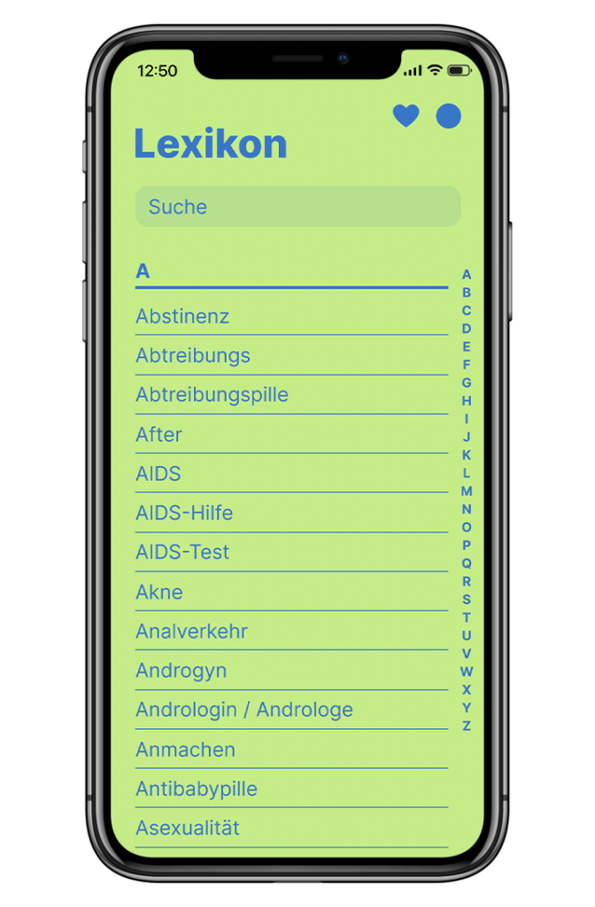
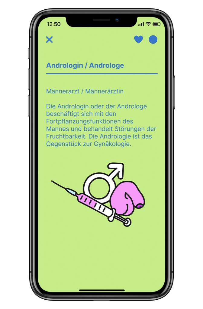
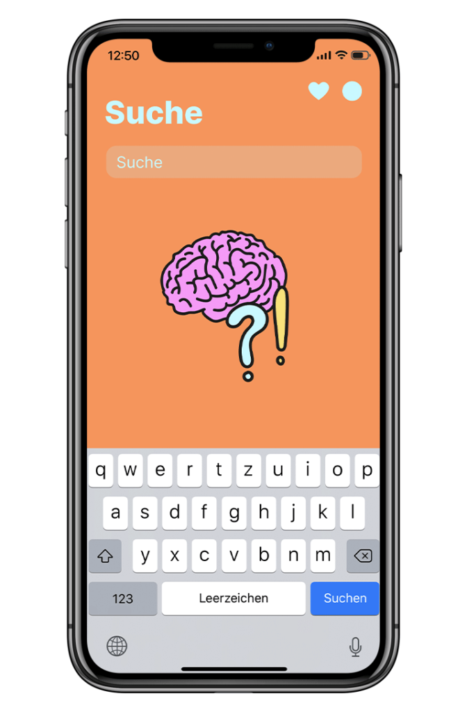
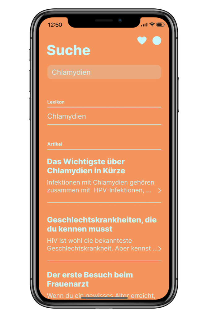
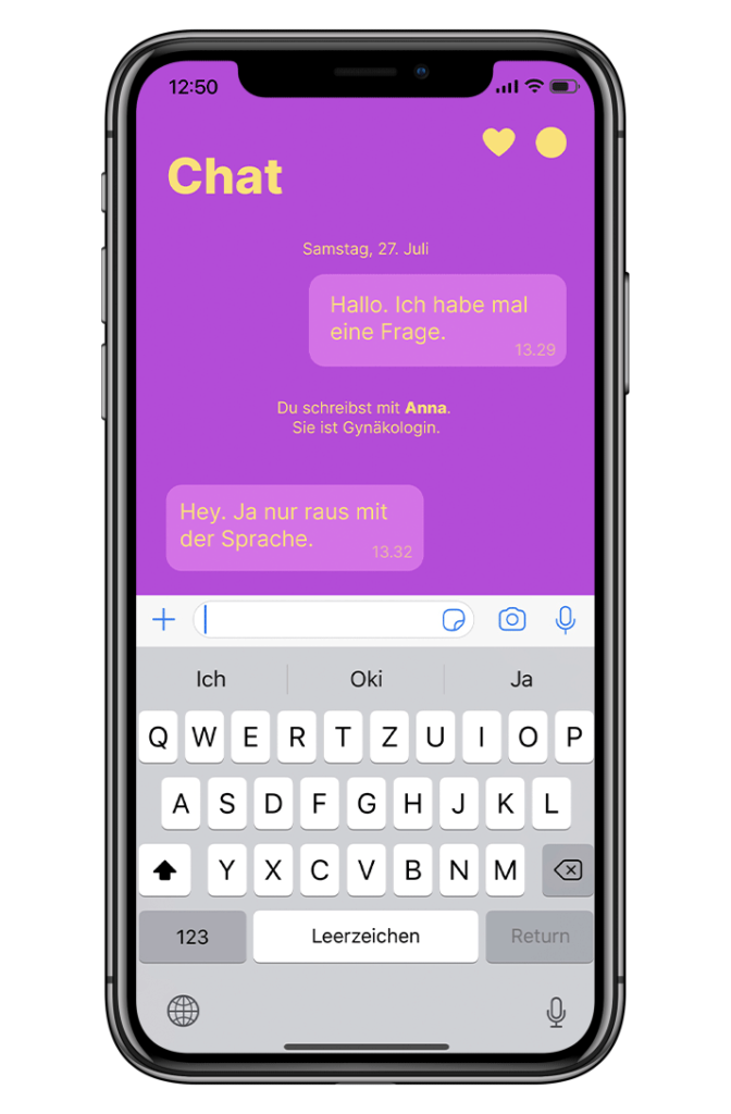
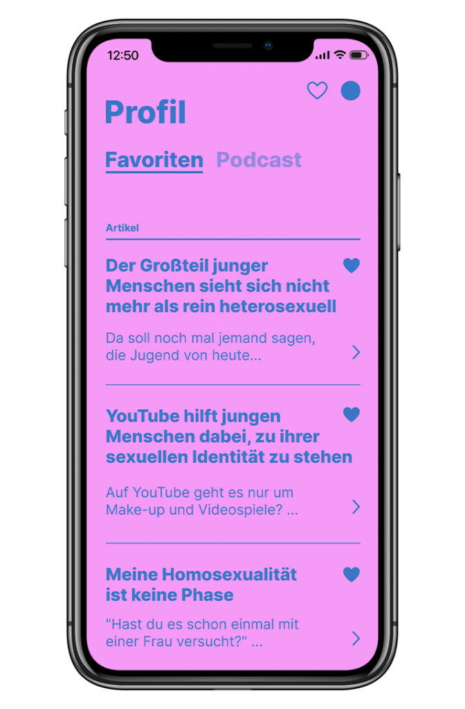
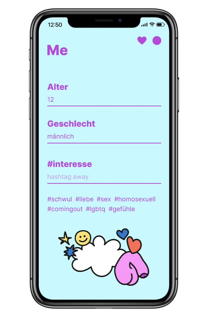
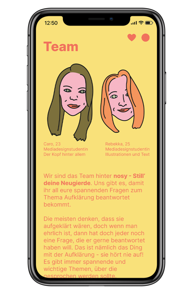
the app tries to fill the knowledge gap between books, websites and school lessons by being a neutral platform for information on the topic. with a funny and open way it encourages younger people to learn about sexuality, love, protection and bodies. just like an anonymous confidant that you can ask any embarrassing question about sex.
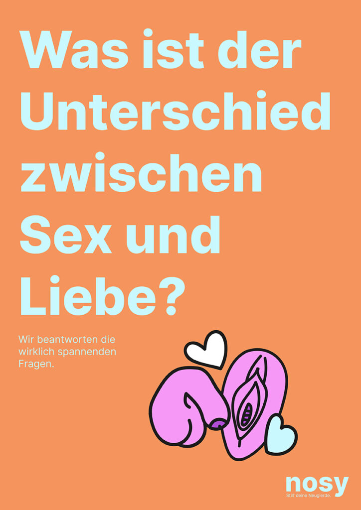
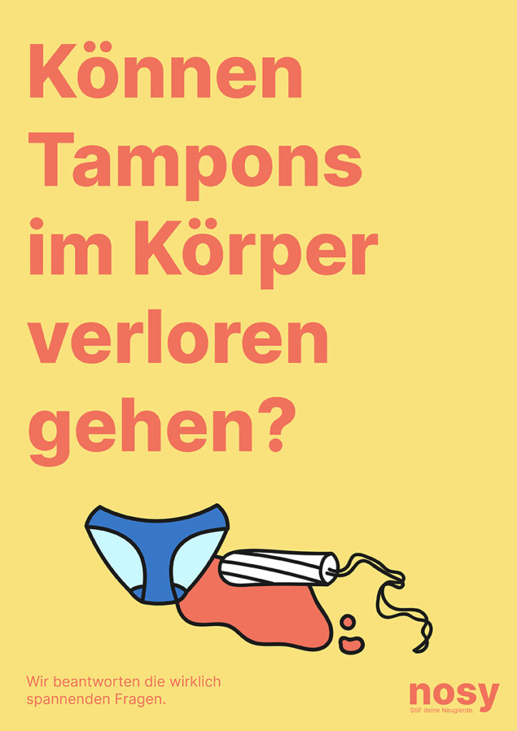
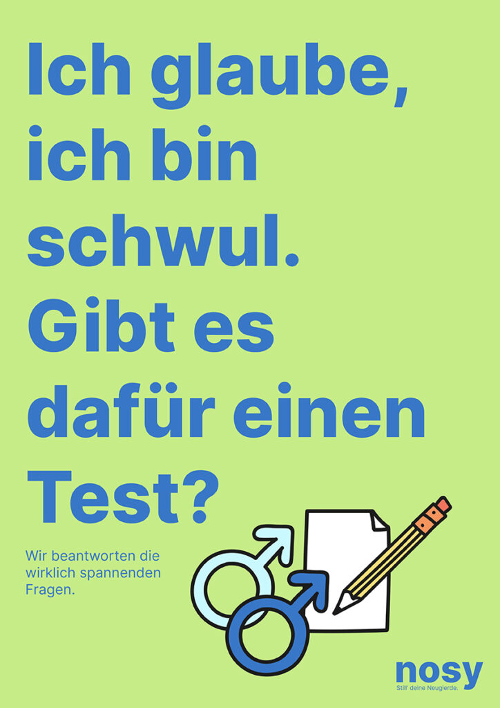
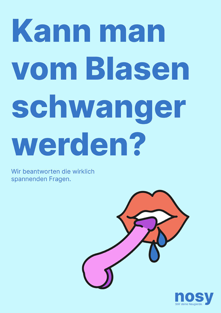
corporate design
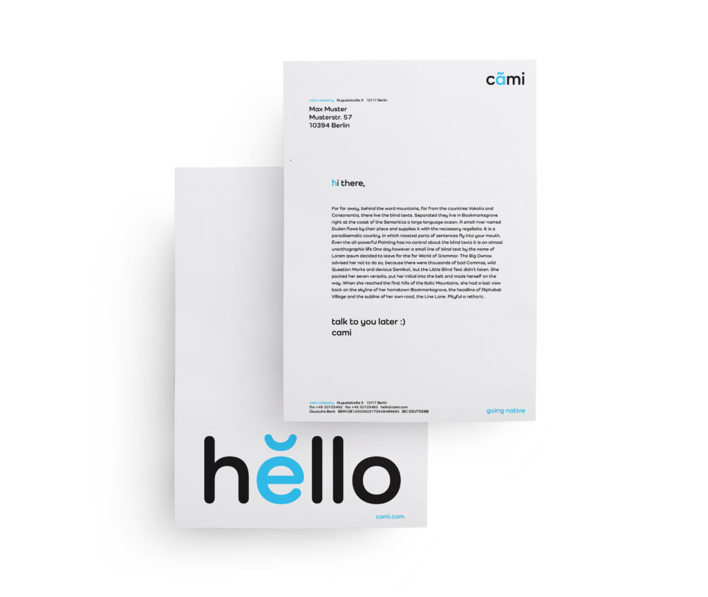
living, talking, going native.
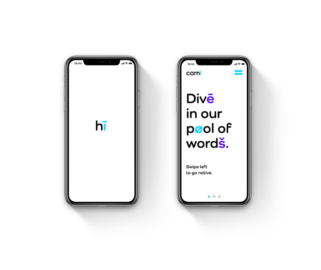
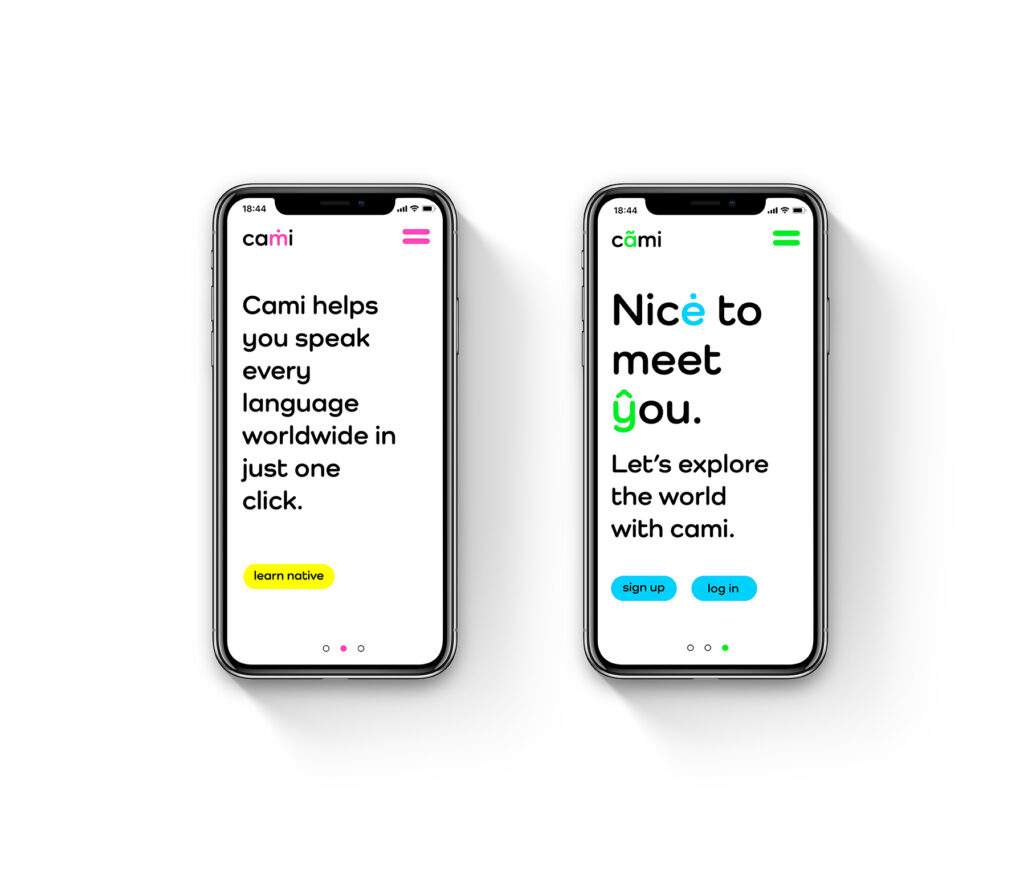
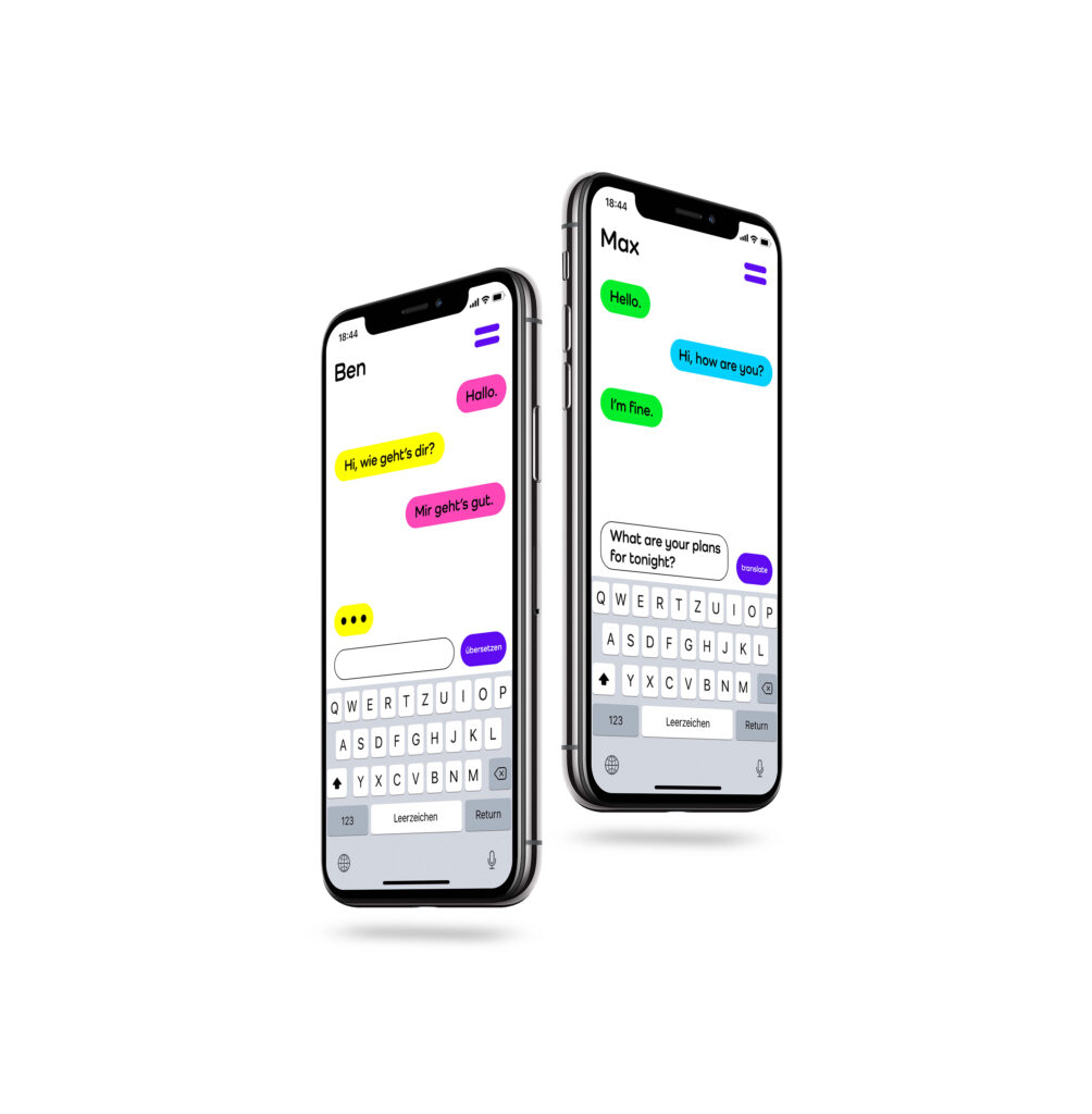
imagine you could not only understand foreign languages but also speak any language there is on this planet. cami, a speaking tool, allows you to travel the world and connect with people and their culture in a way you’ve never experienced before. the included GPS tracks you and lets you speak the countries language on a native level. this way we can not only prevent languages to die out but also maintain the cultural diversity of this planet.
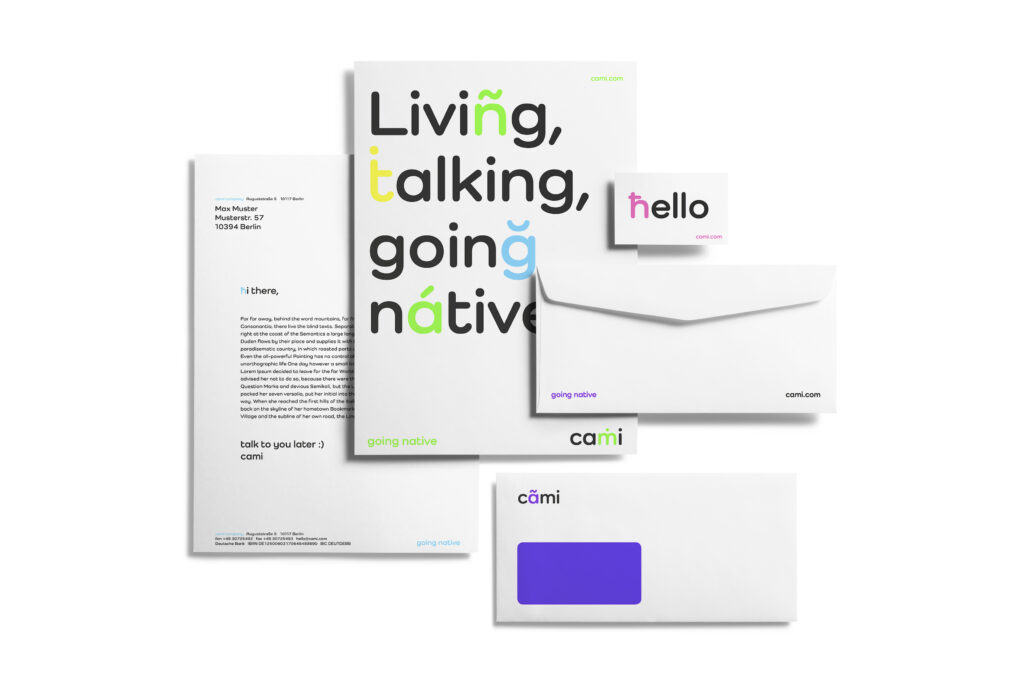
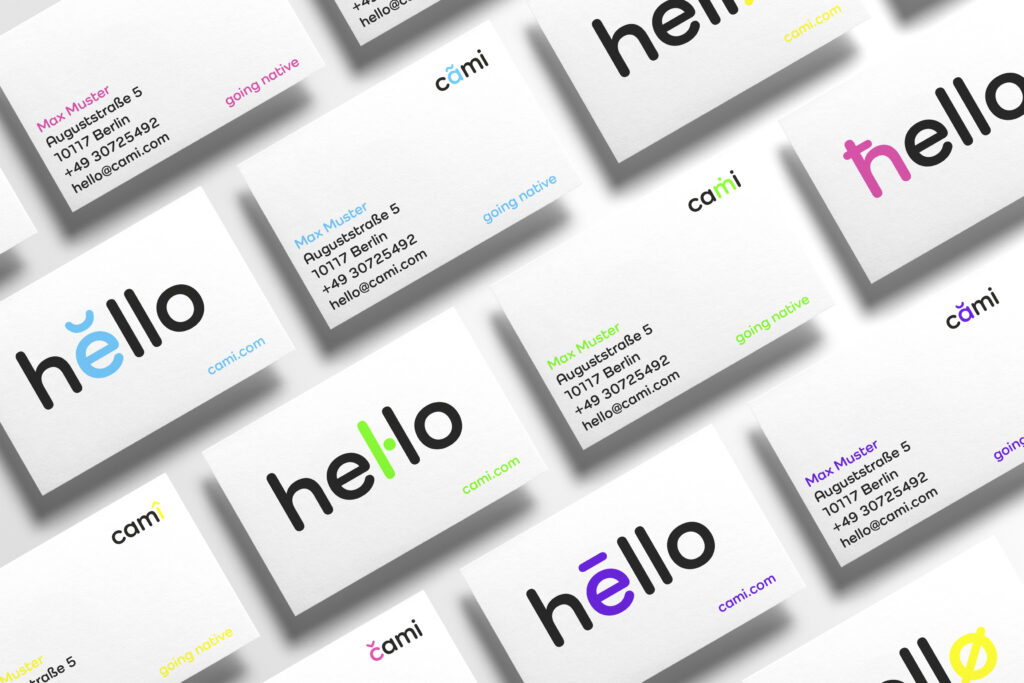
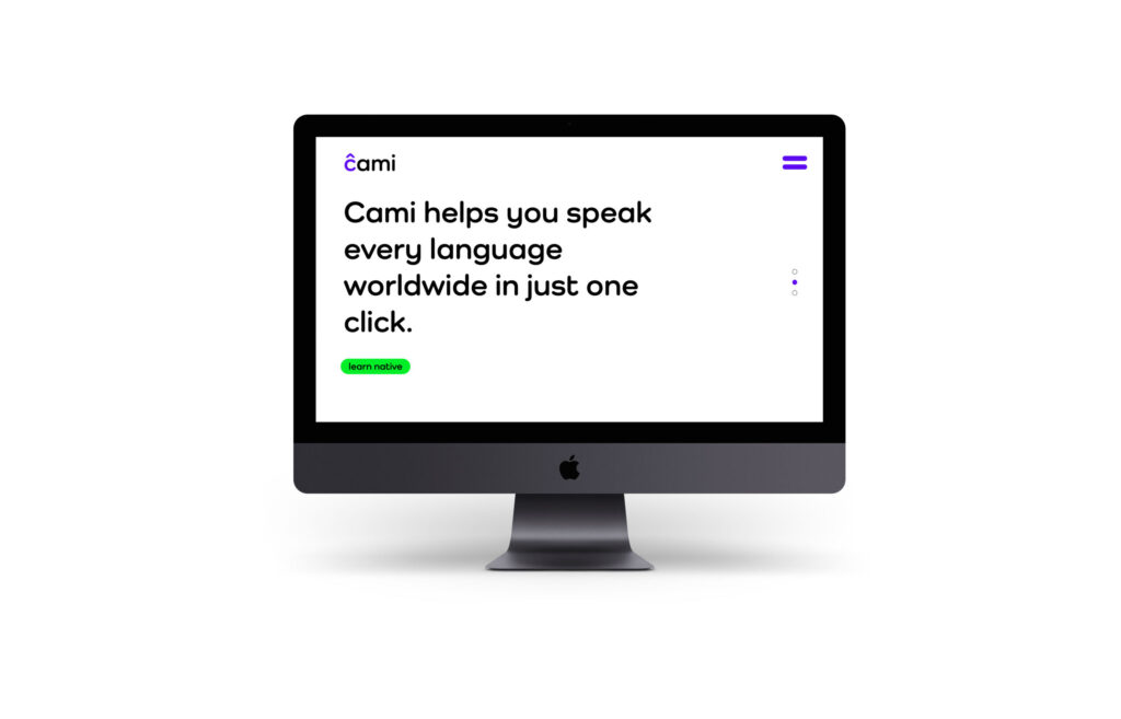
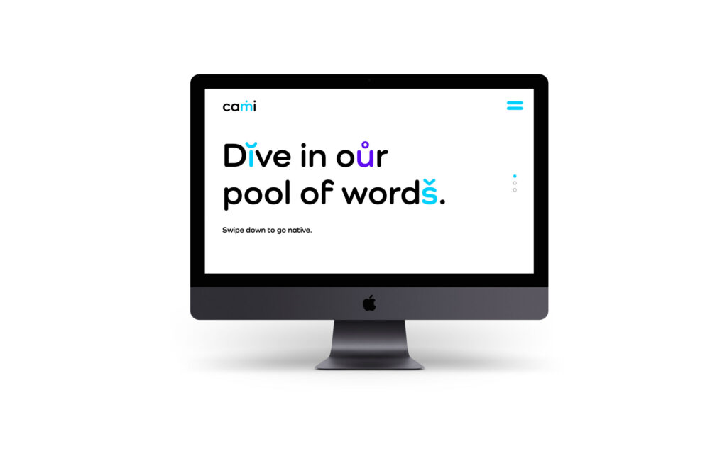
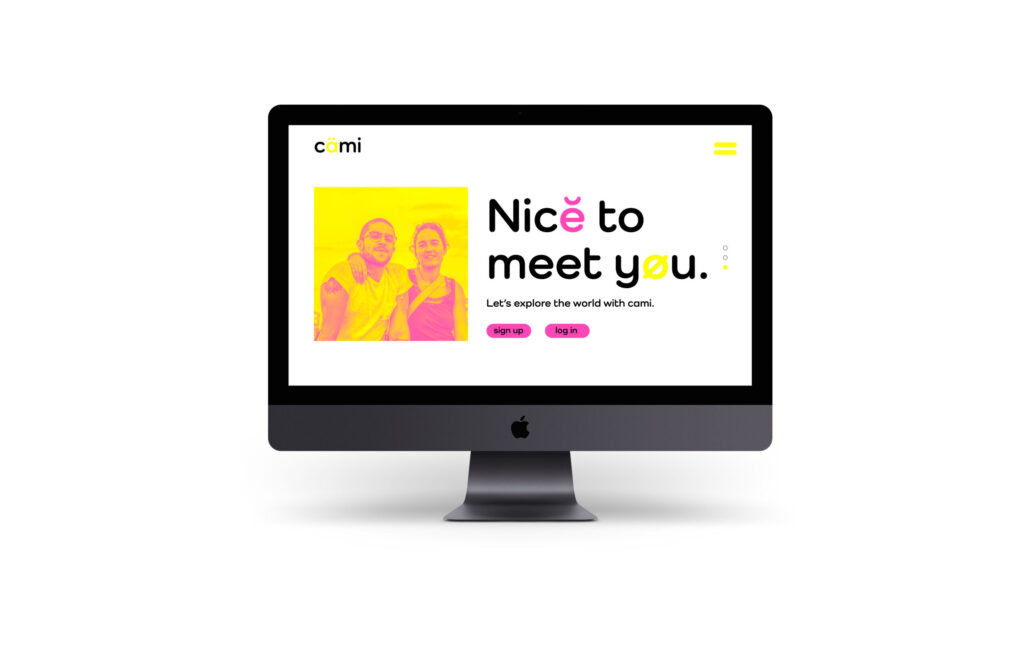
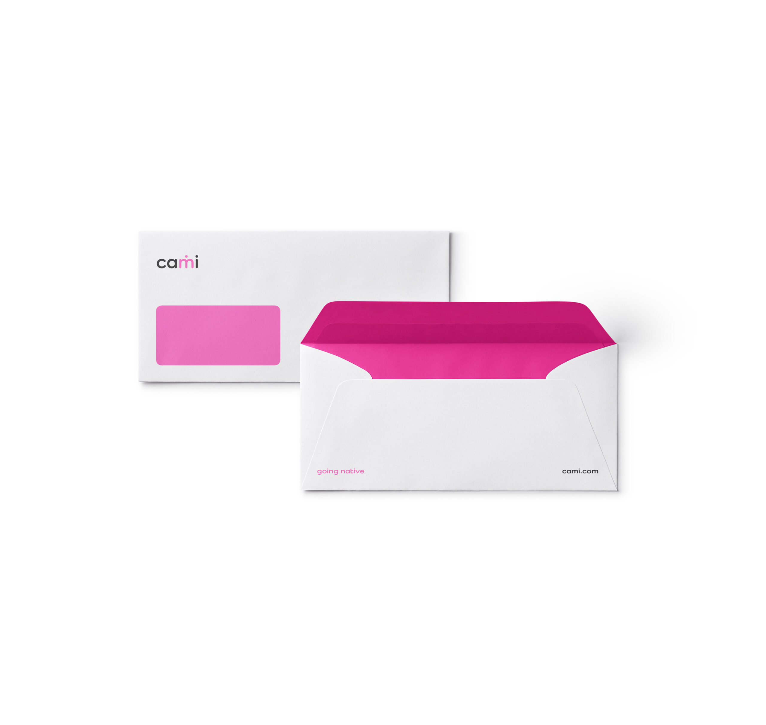
the name cami comes from the chameleon which changes its color not as widely believed to camouflage but to communicate with its conspecifics. the colorful design triggers you to be active and be a part of your travel surroundings so you can feel and understand on a deeper level. it is a border crossing travel experience.
thjnk berlin
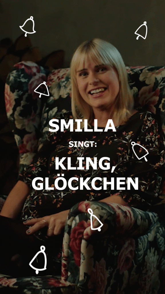
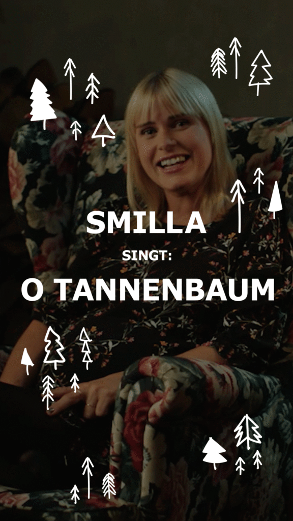
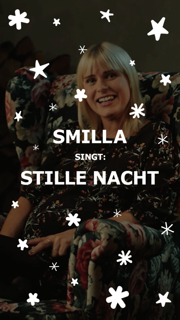
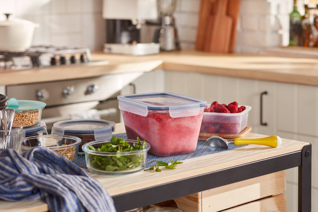
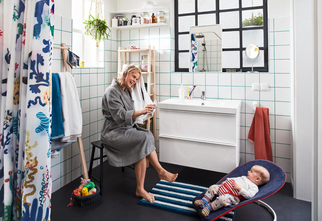
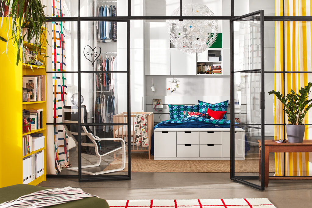
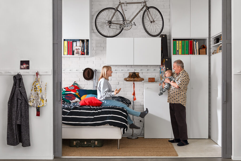
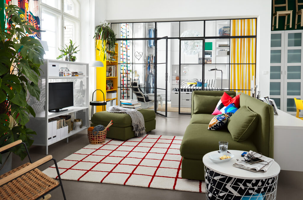
my first project working at thjnk berlin was „smilla singt“ (smilla sings) for IKEA. it was so much fun to try out different ways and to play around with illustrations and karaoke styles.
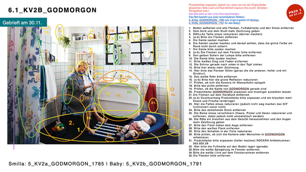
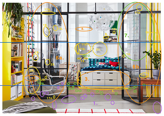
later on i got to work more for IKEA on big fotoshoots. not only was i able to be on set and meet the client i was also able to lead the postproduction briefings and present them to the client.
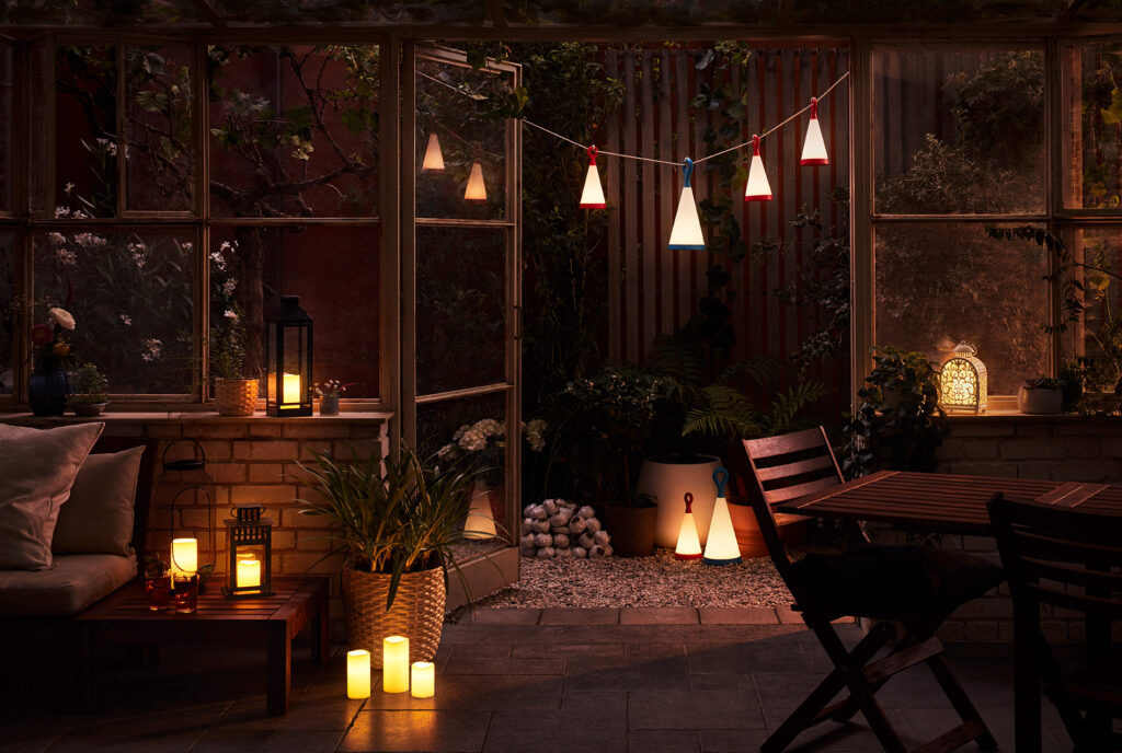
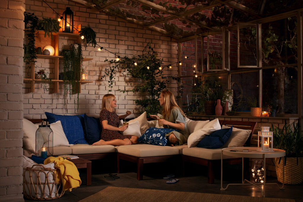
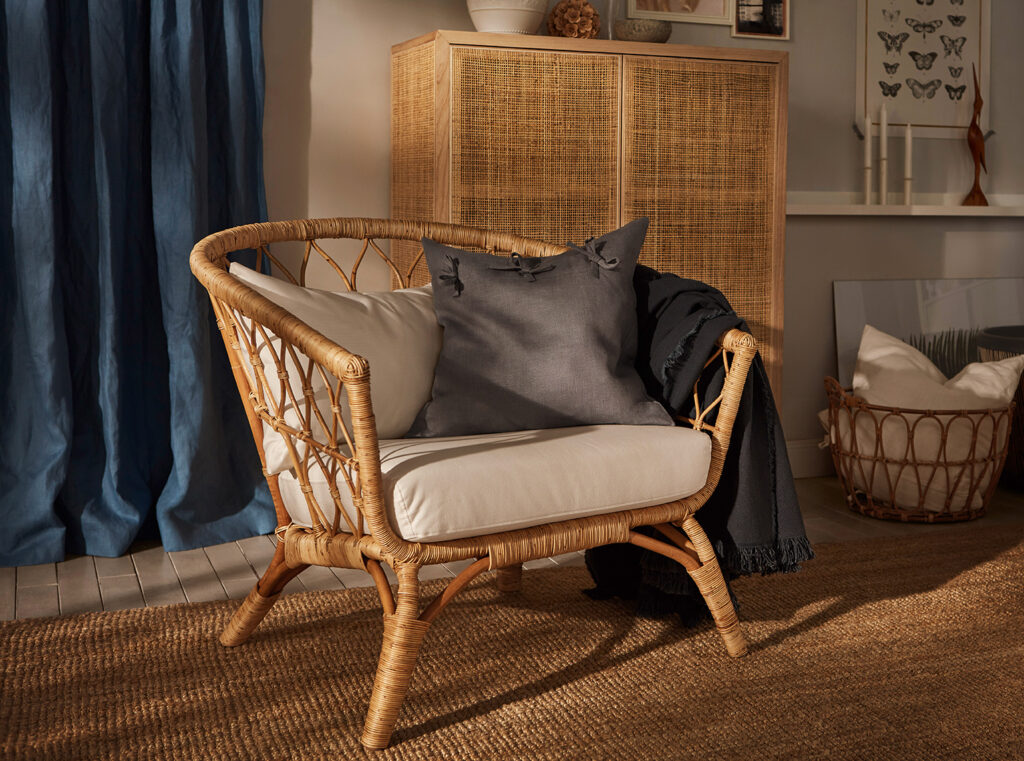
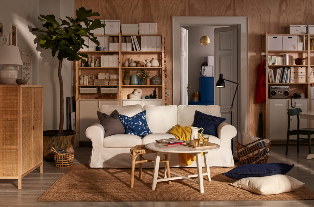
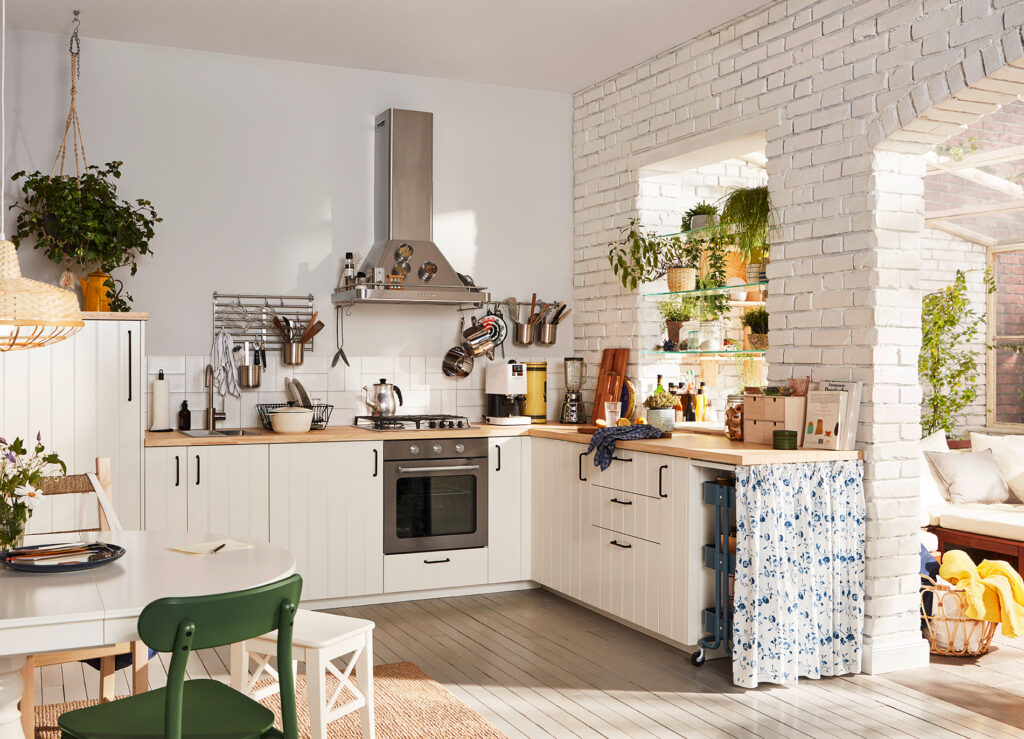
during my time at the agency i was working on three different shoots and writing very detailed postproduction briefings from start to finish. below you can see an example.
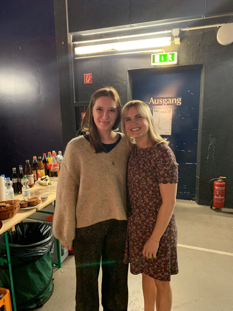
i also got to meet smilla, the main character for IKEA germany advertisement.
thjnk berlin
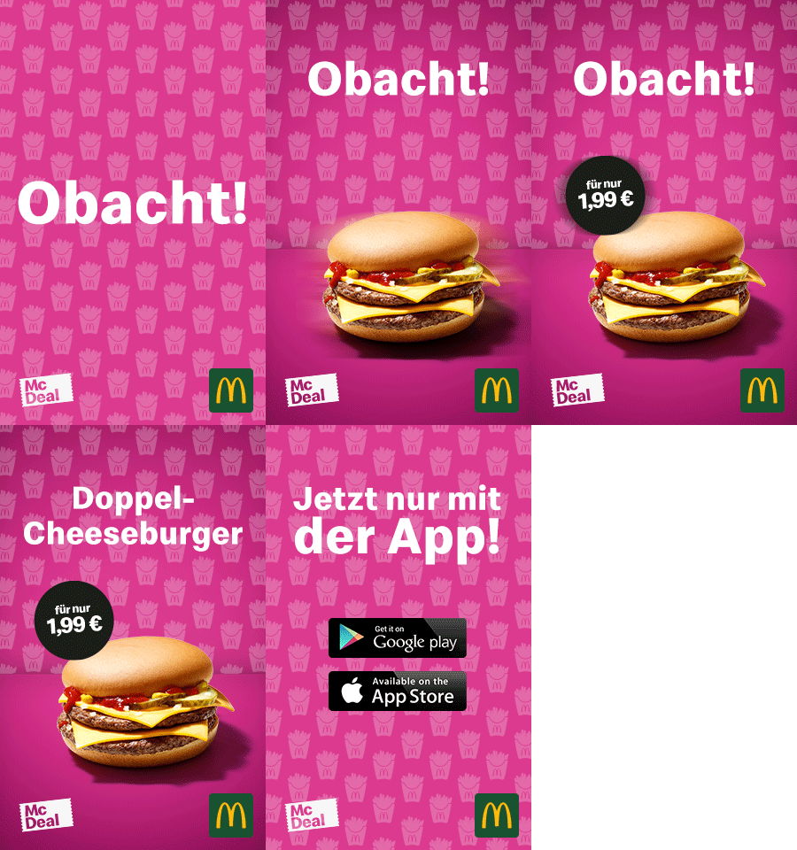
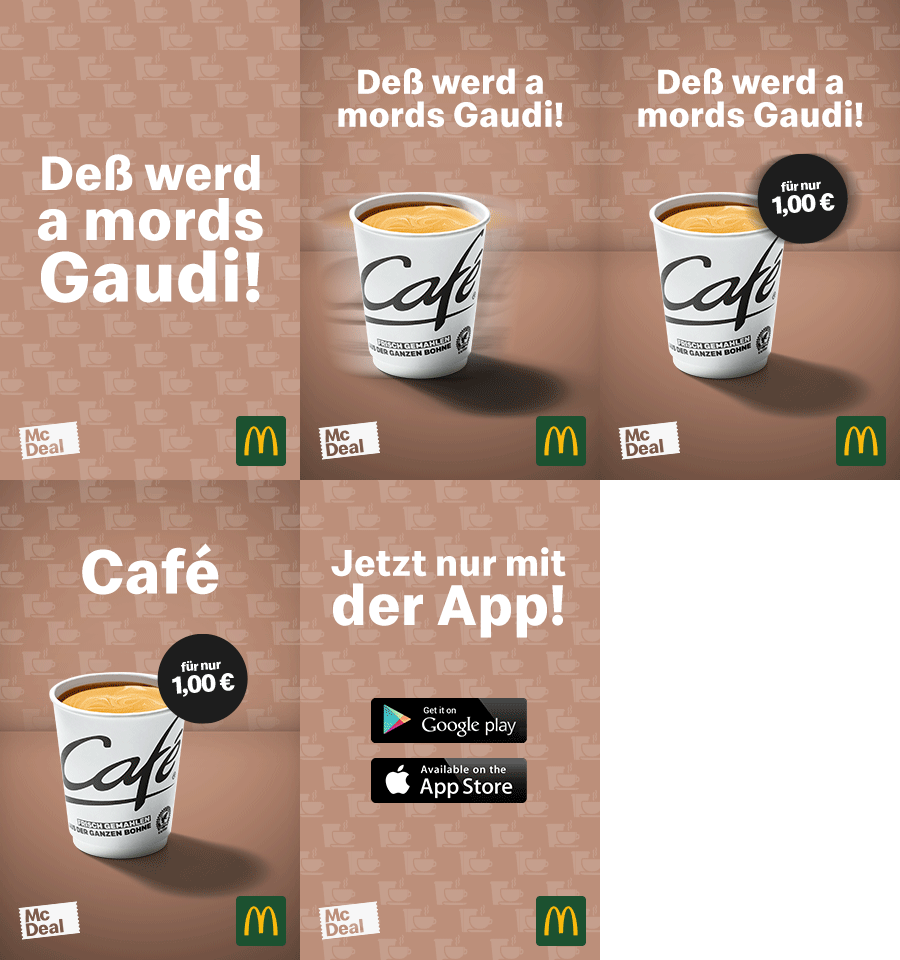
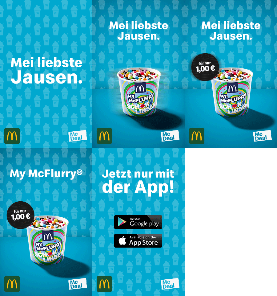
during my time at the advertisement agency thjnk berlin GmbH i worked on some projects for McDonald’s. here you can see a little bit of the outcome. most of it was for social media.
i made this little illustration back in march when the lockdown started and McDonald’s wanted to advertise other ways to buy and eat their products. it was a very quick sketch and a lot of fun to see that a big brand like McDonald’s would use it on instagram.
logo design
a logo/signet not only needs to be reduced, symbolic, constructed and graphical but also recognizable for the people out there. only by analyzing the brand/business and its uniqueness you can then create a graphic logo for a company that can be relatable and meaningful.

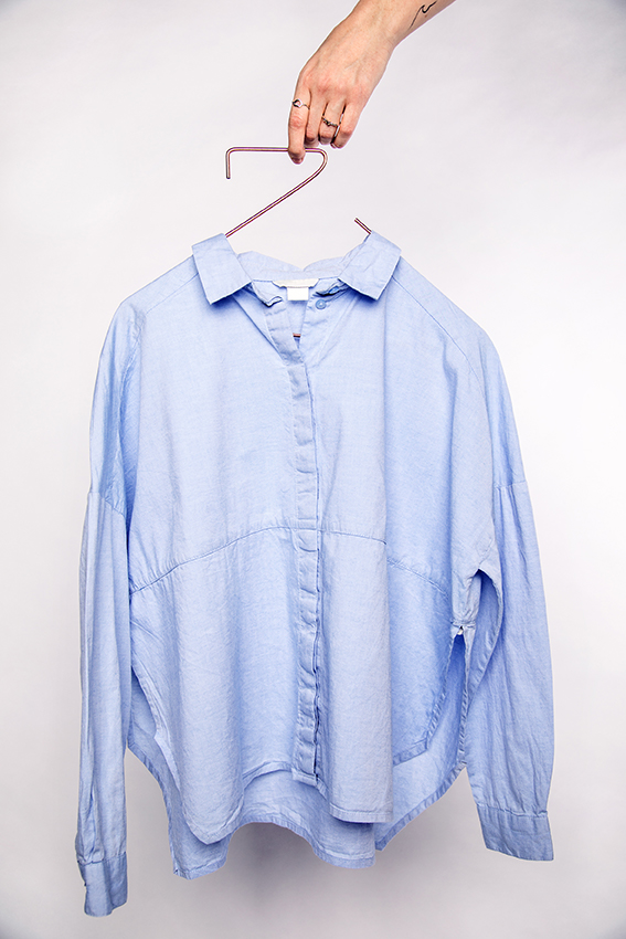
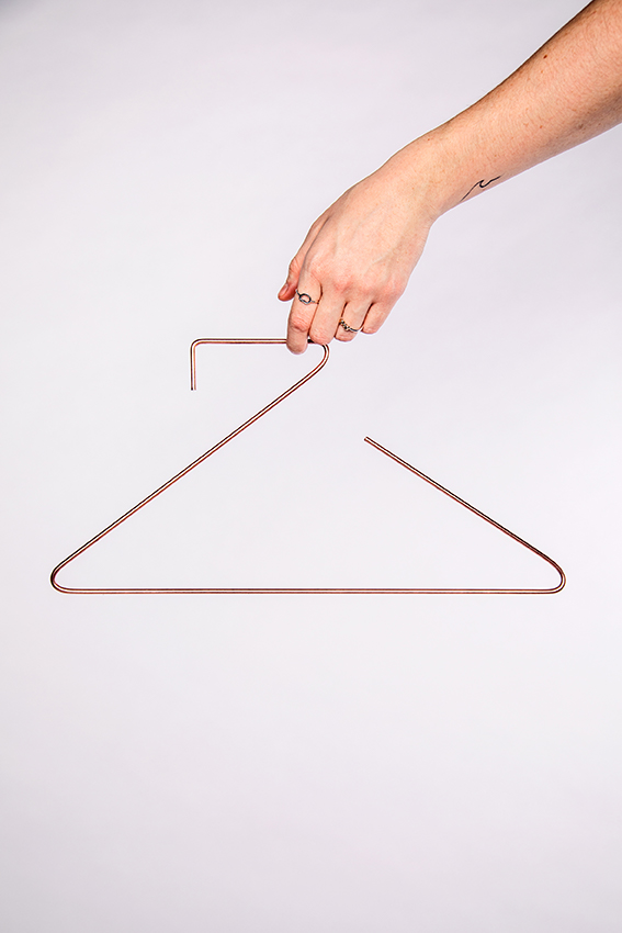
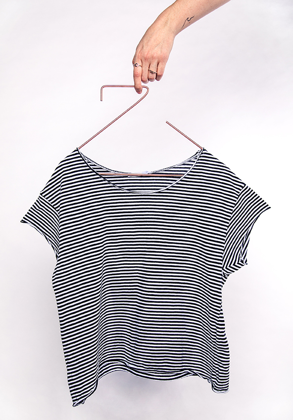
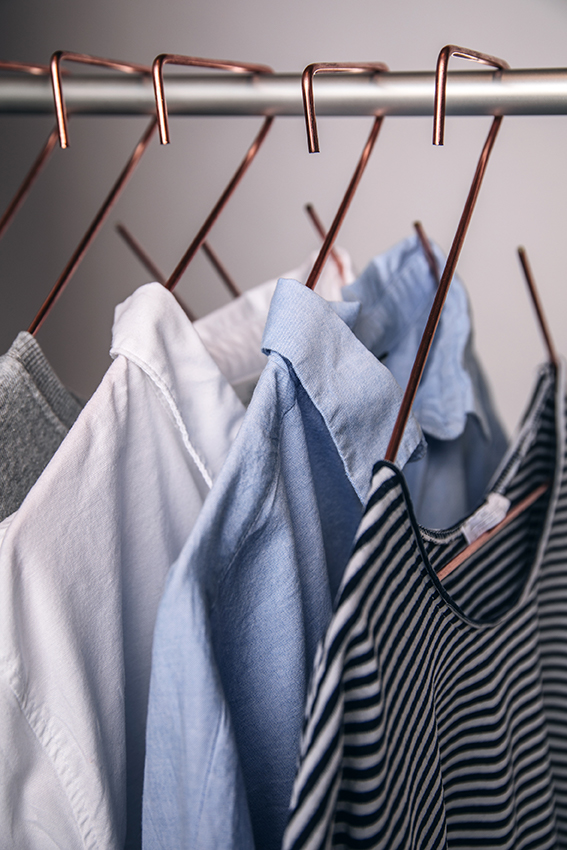
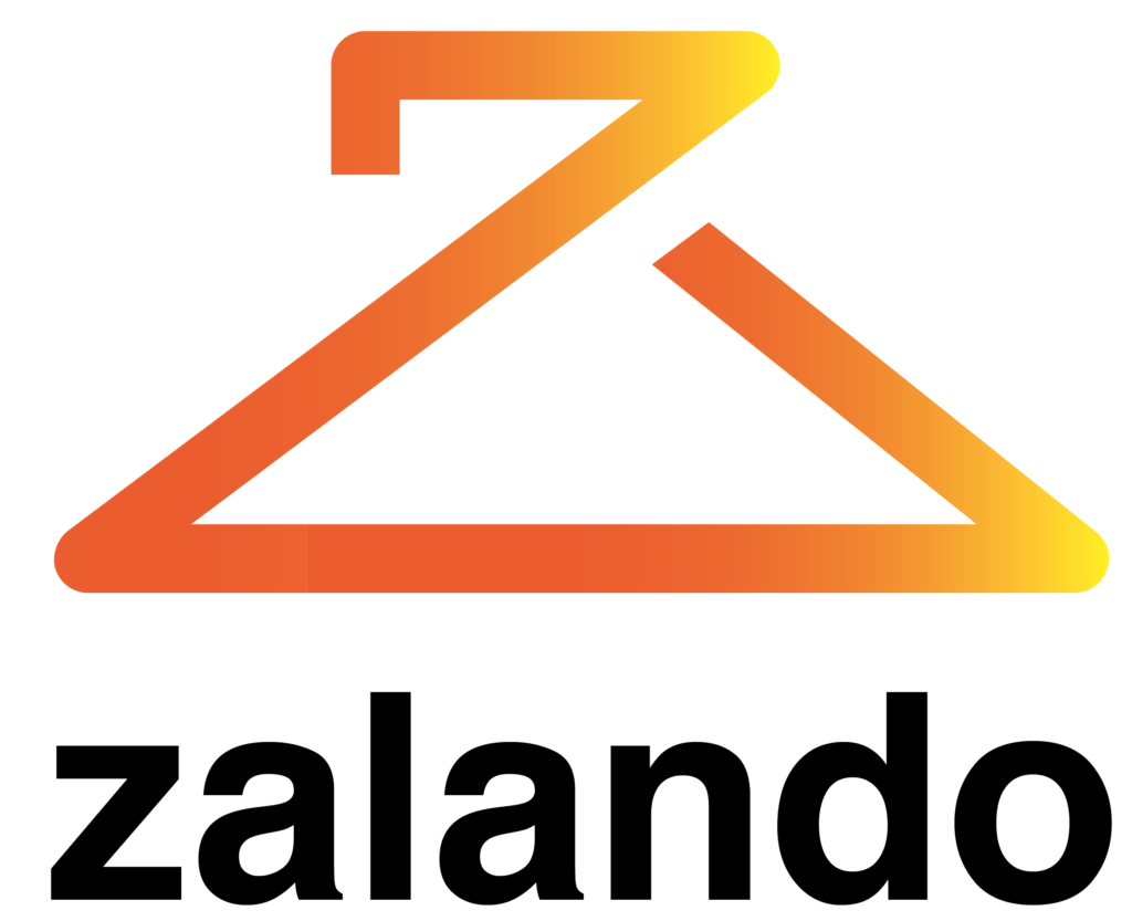
the logo combines the letter z for zalando and a hanger (the fashion symbol). by not only being a logo but also a product this hanger can be used as merchandise or for marketing strategies. cause when working with brands and their identities it is always important to see the whole picture.
editorial design
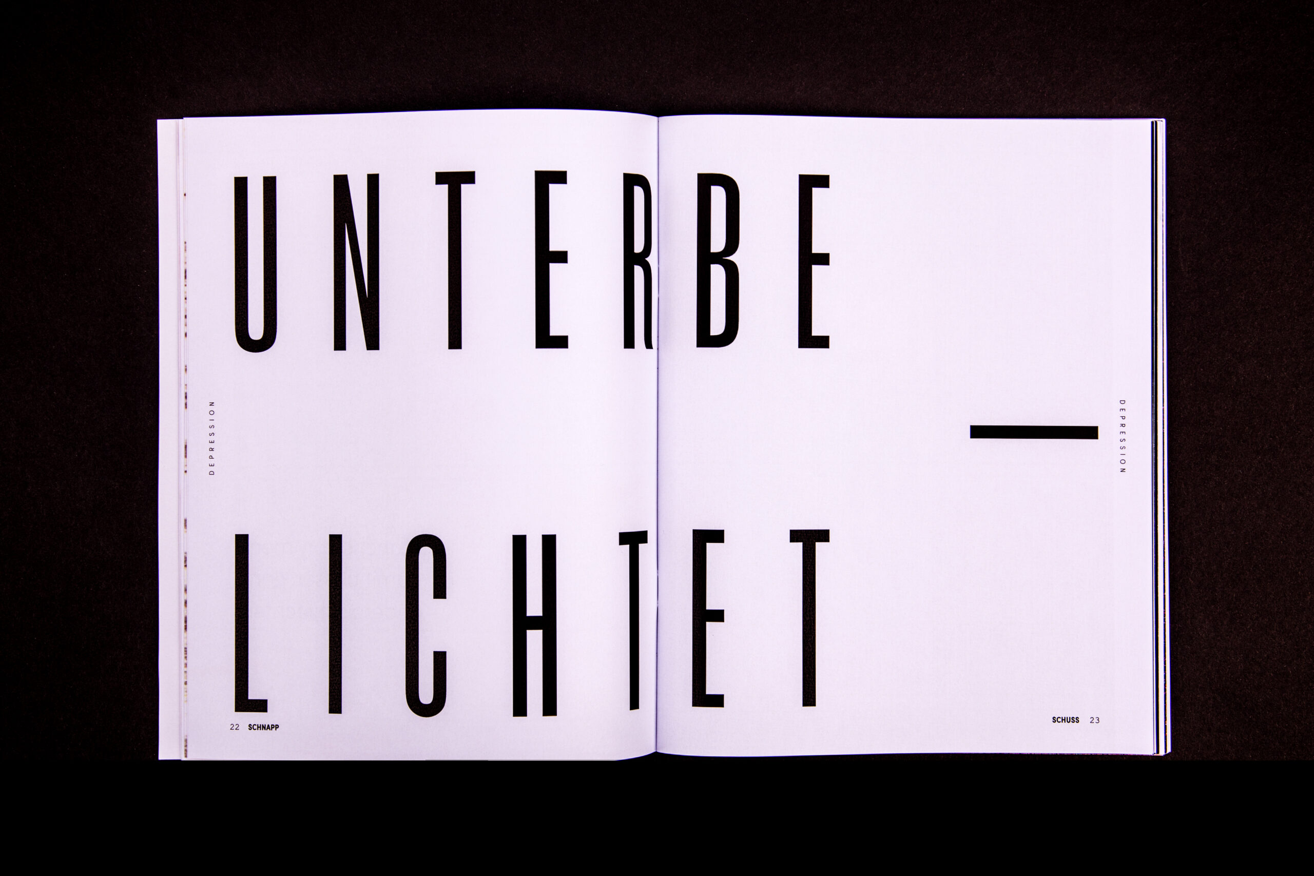
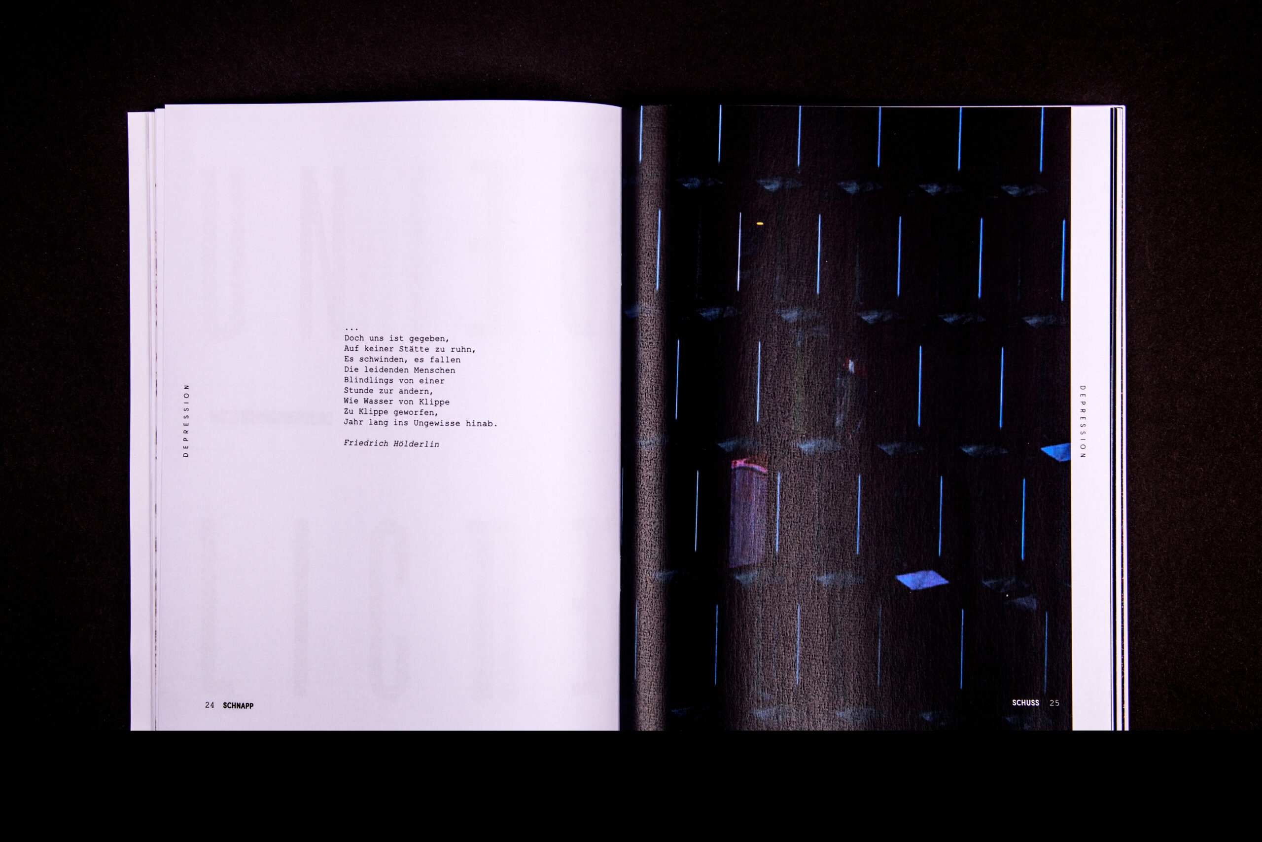
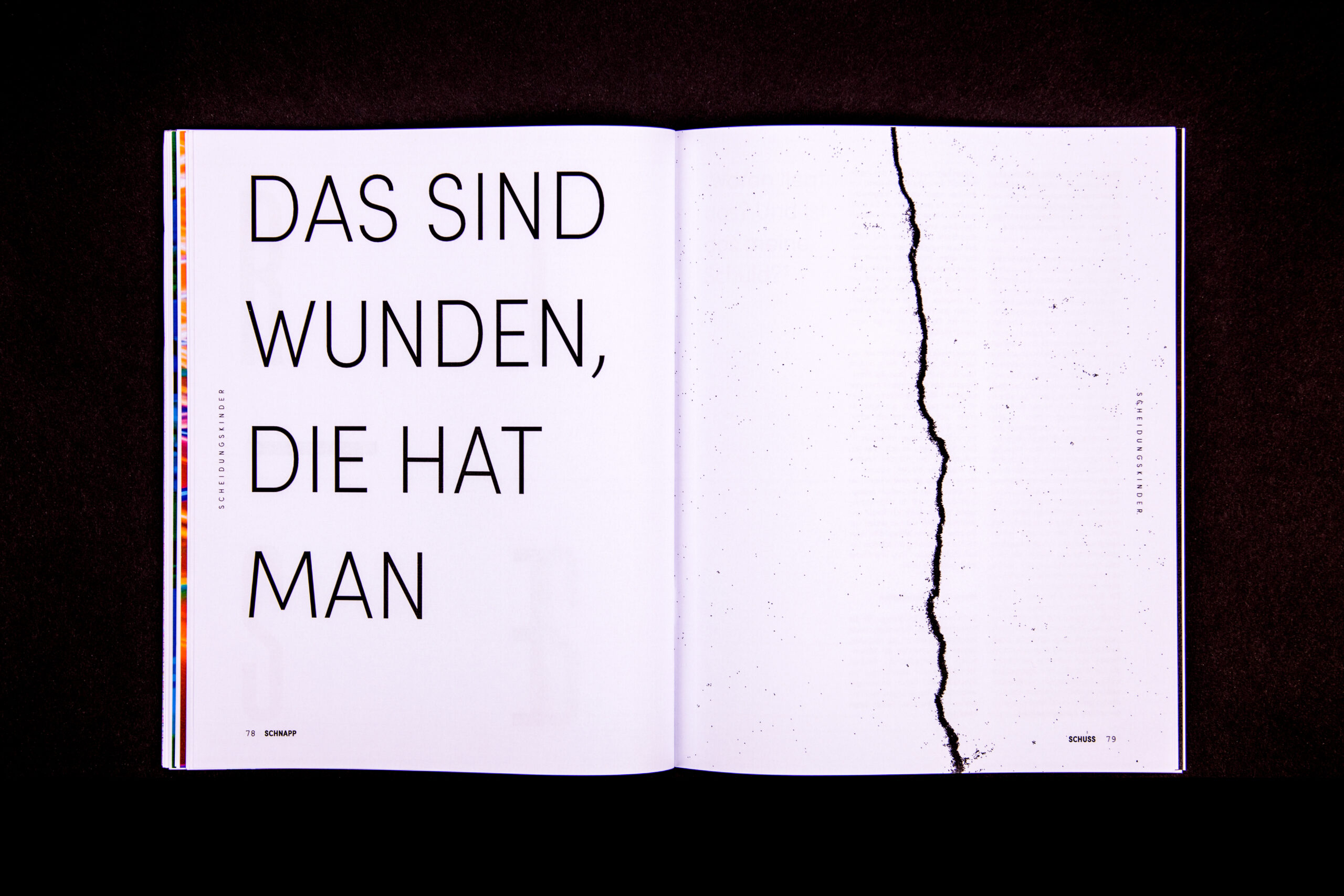
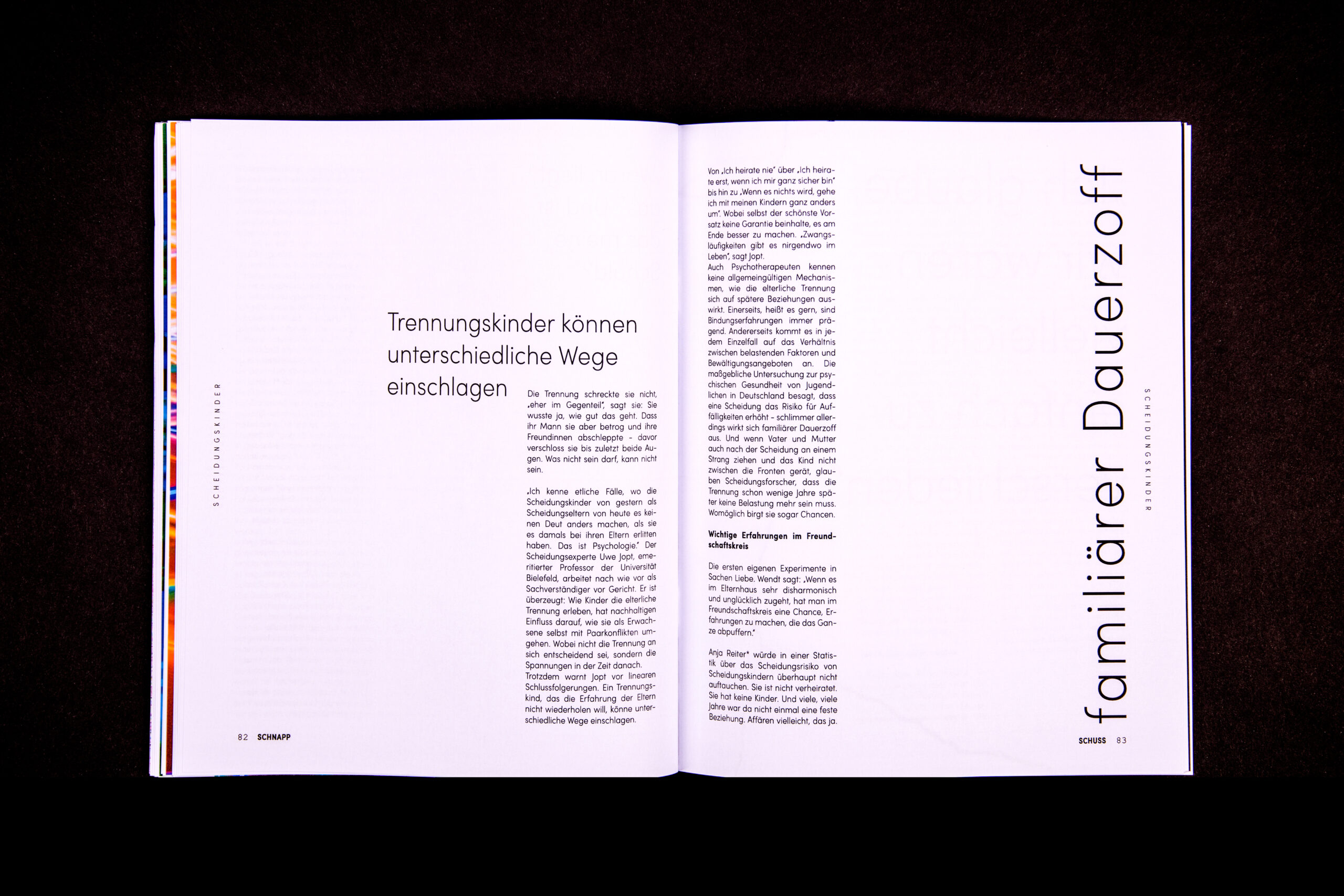
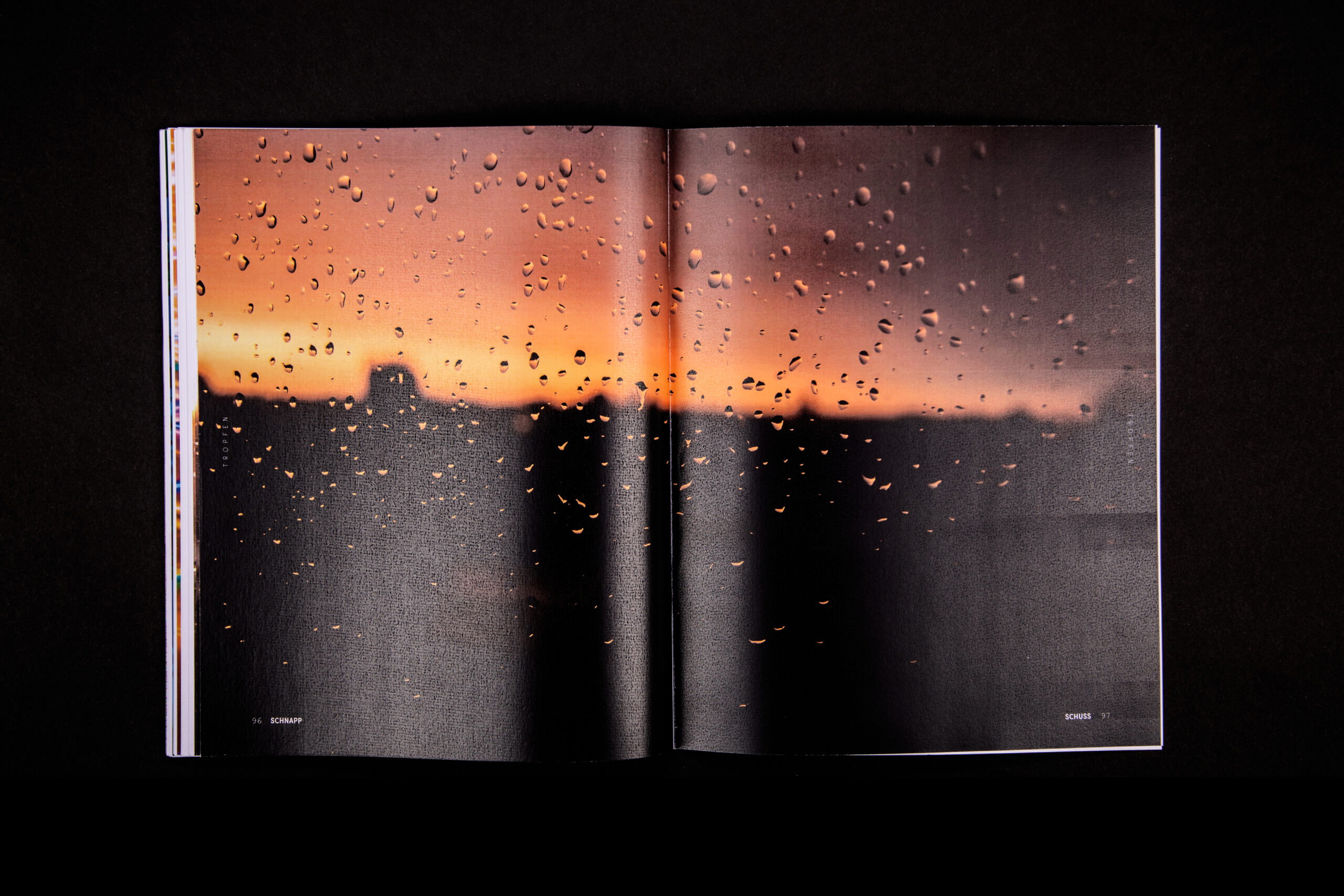
schnappschuss is a magazine about the faults in photography and the so-called faults in our society. sometimes a mistake can create something beautiful – like these snapshots. overexposed, underexposed, blurred or even photos with pixels are all considered defective.
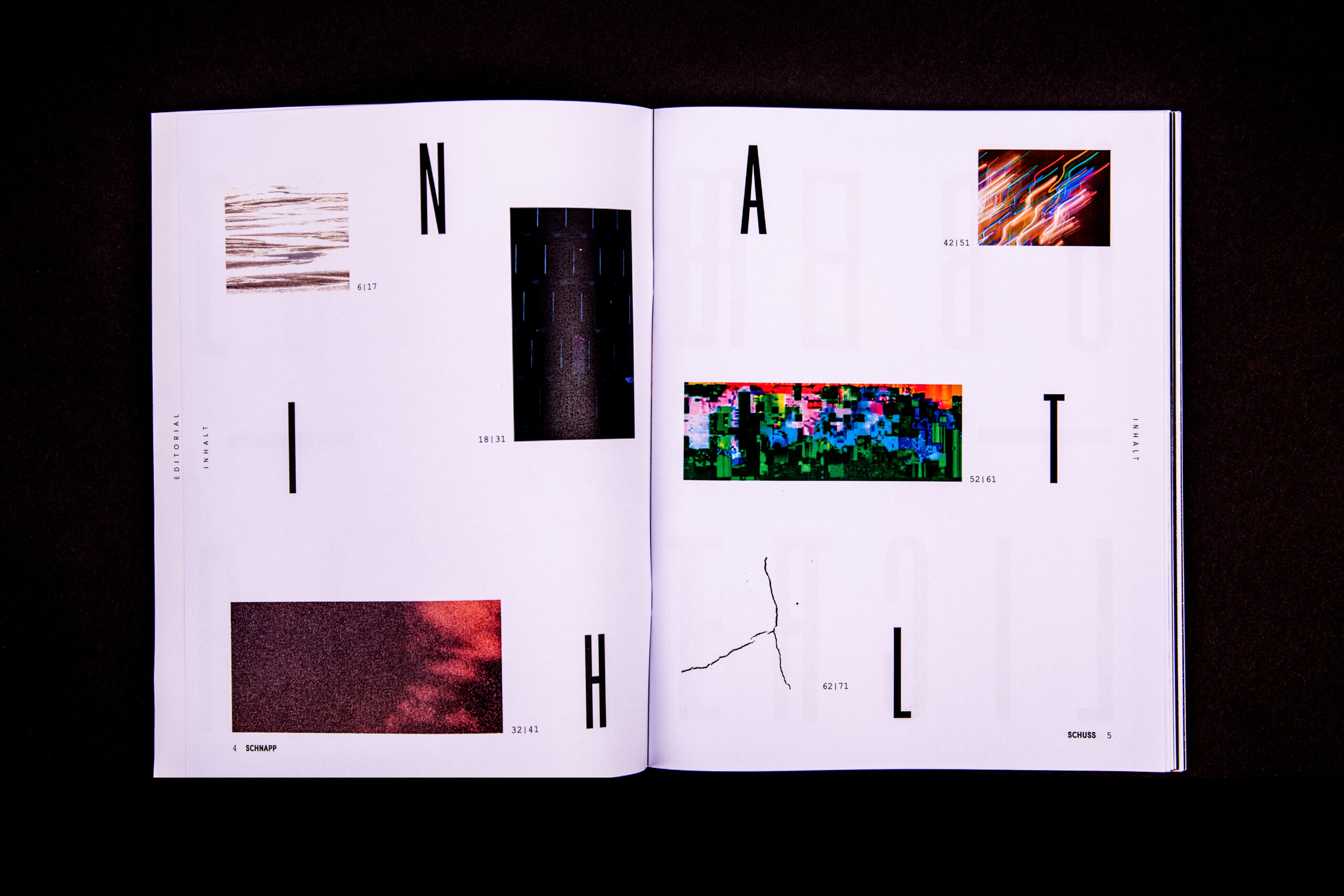
but look at their beauty up close. ADHD, depression and drug addiction are also seen as faults in someones life. this magazine tries to take a step back and create a different perspective about „faults“. because life can feel dark, blurry or even too bright sometimes. and that is okay.
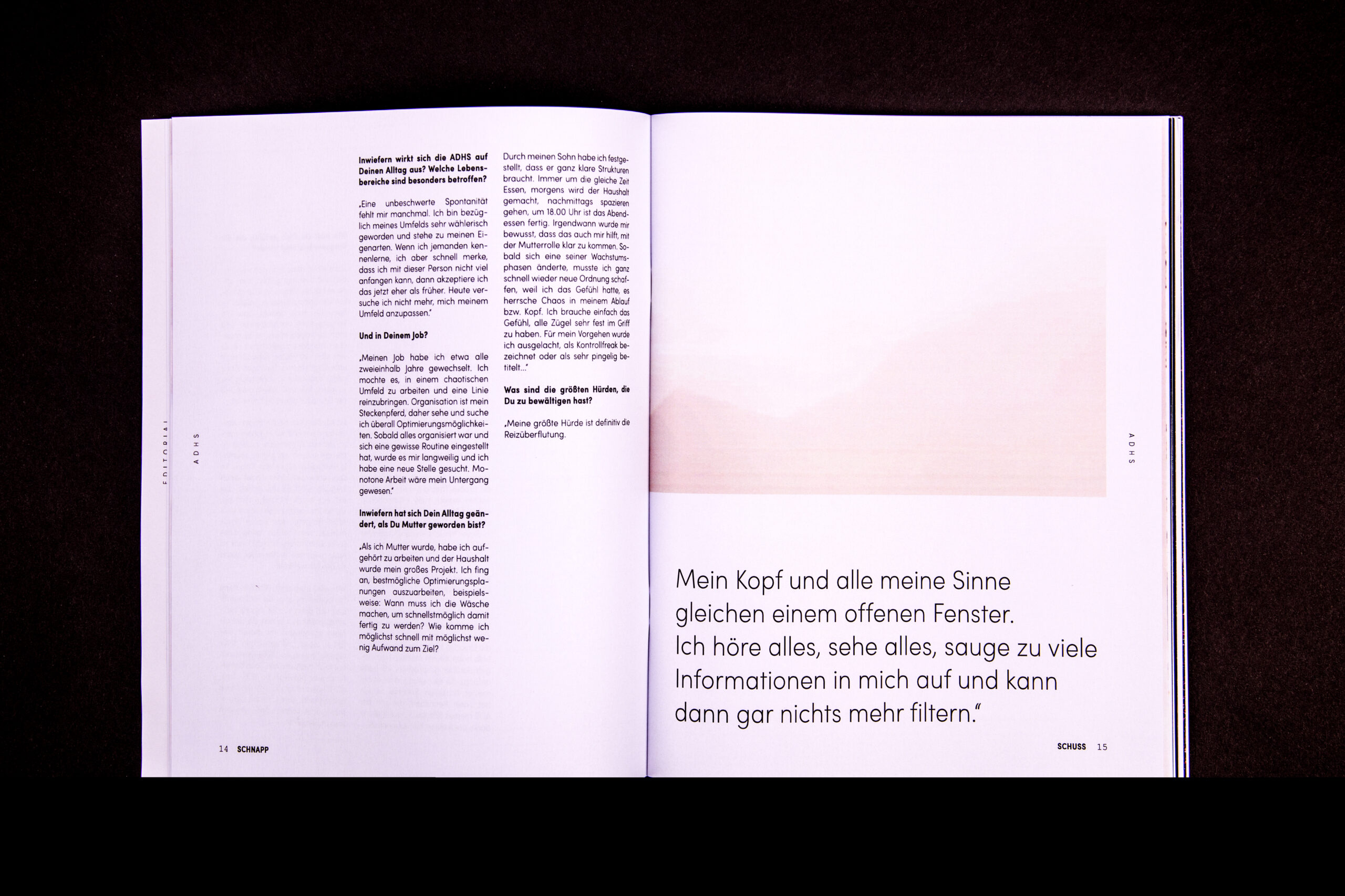
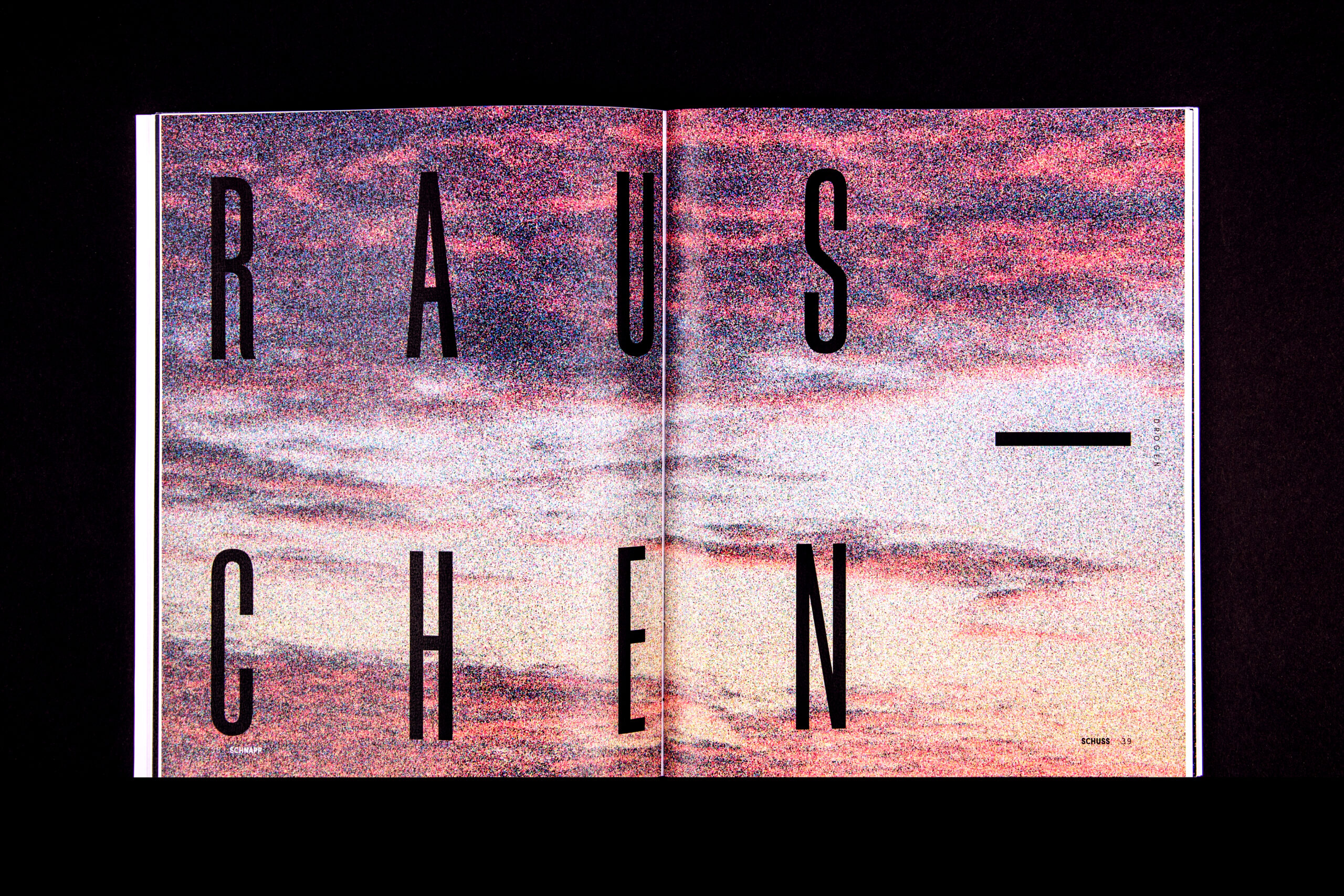
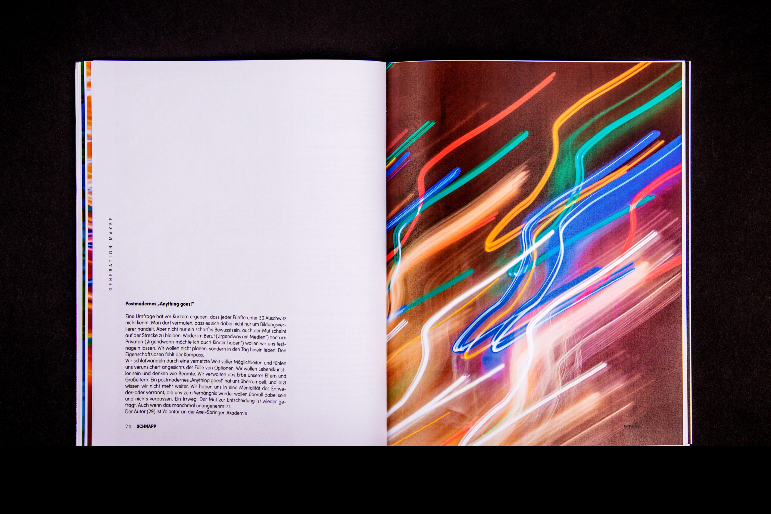
overexposed – ADHD
underexposed – depression
image noise – drugs
pixels – tv
blurry – generation maybe
cracks – divorced child
film
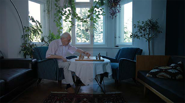
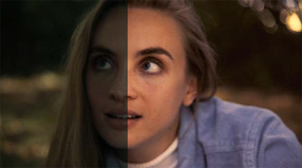
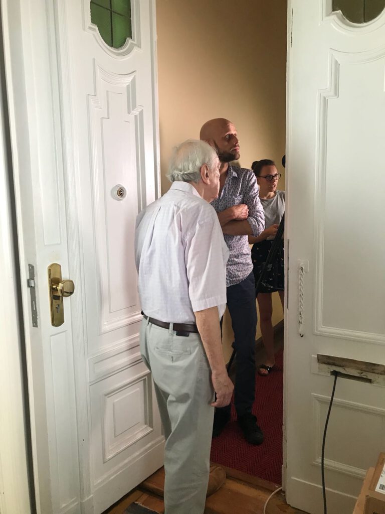
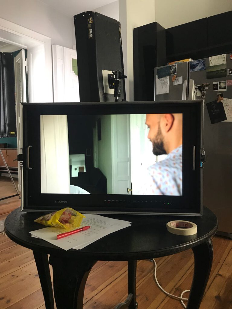
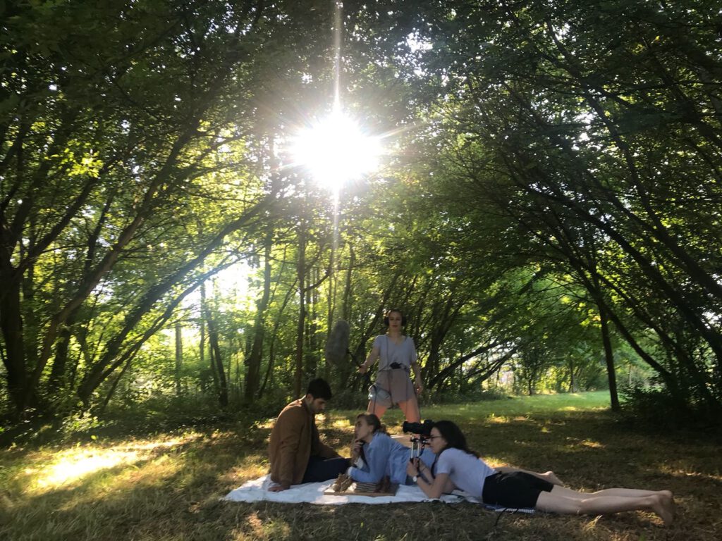
what happens when you get old and lonely? when you lose your partner and there is no one left for you? in germany, there are around two million elderly people (over the age of 80) living by themselves. and every fourth person only gets visited once a month. imagine how lonely they must feel. no wonder the suicide rate is higher than in any other age group.
rose – a voice against loneliness – wants to help people who feel lonely and need someone to talk to. this AI can be programmed with any voice (for example your deceased spouse) to make them feel close to their beloved ones again and to make them feel heard.
brand study
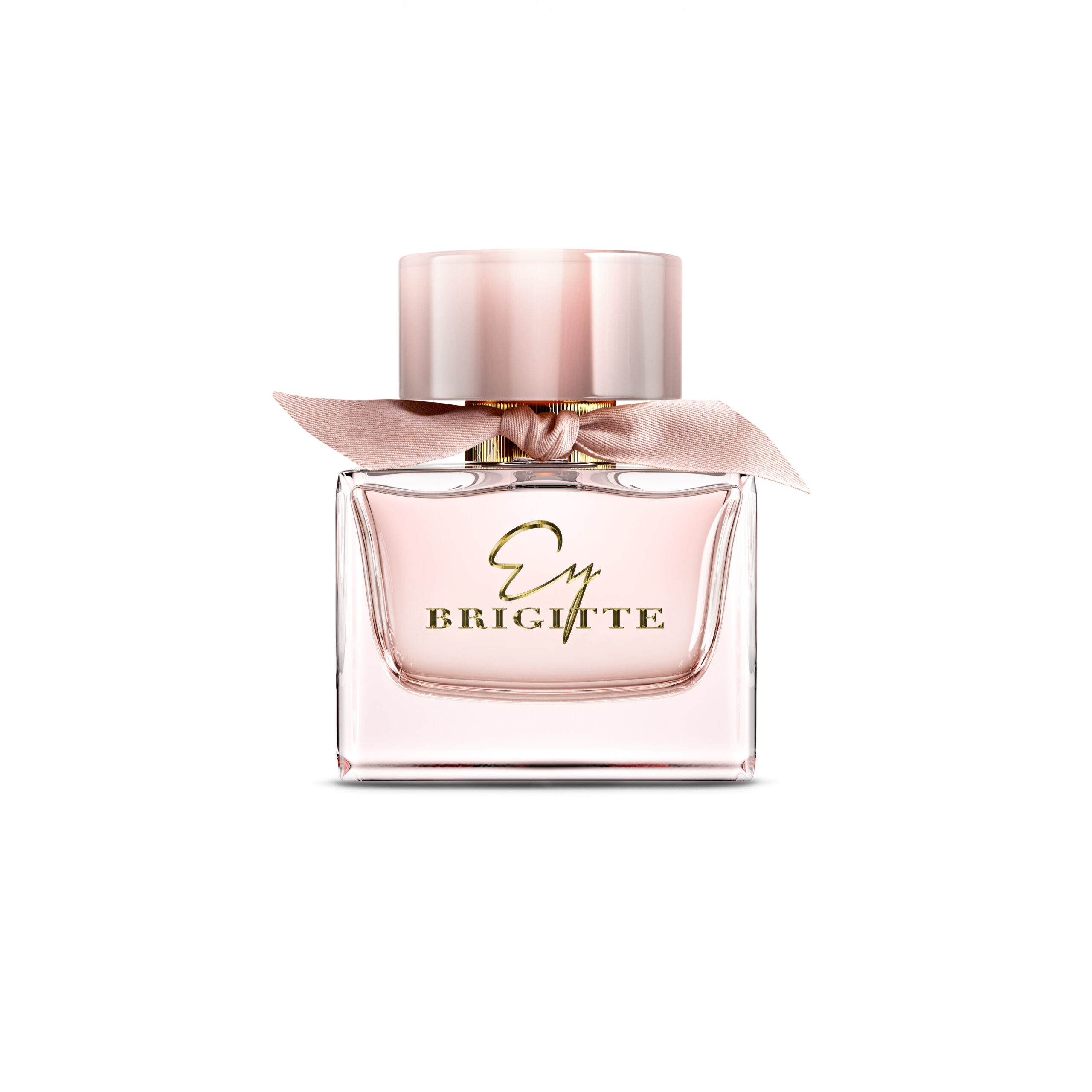
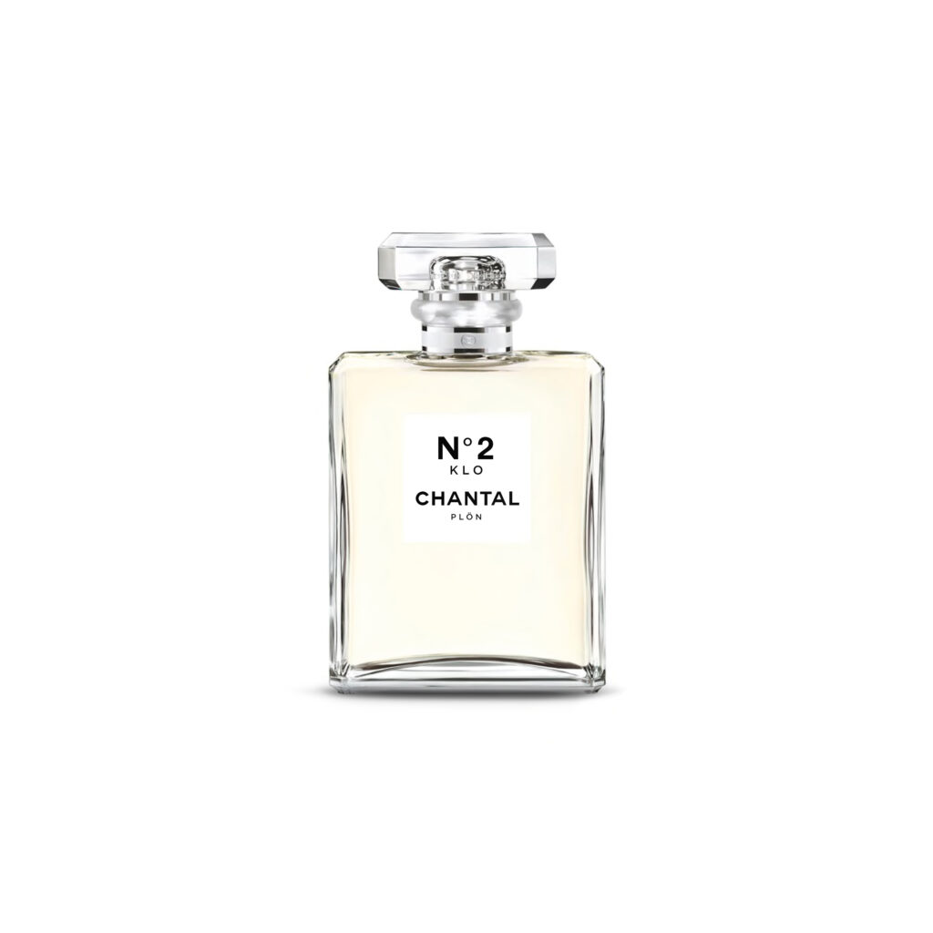
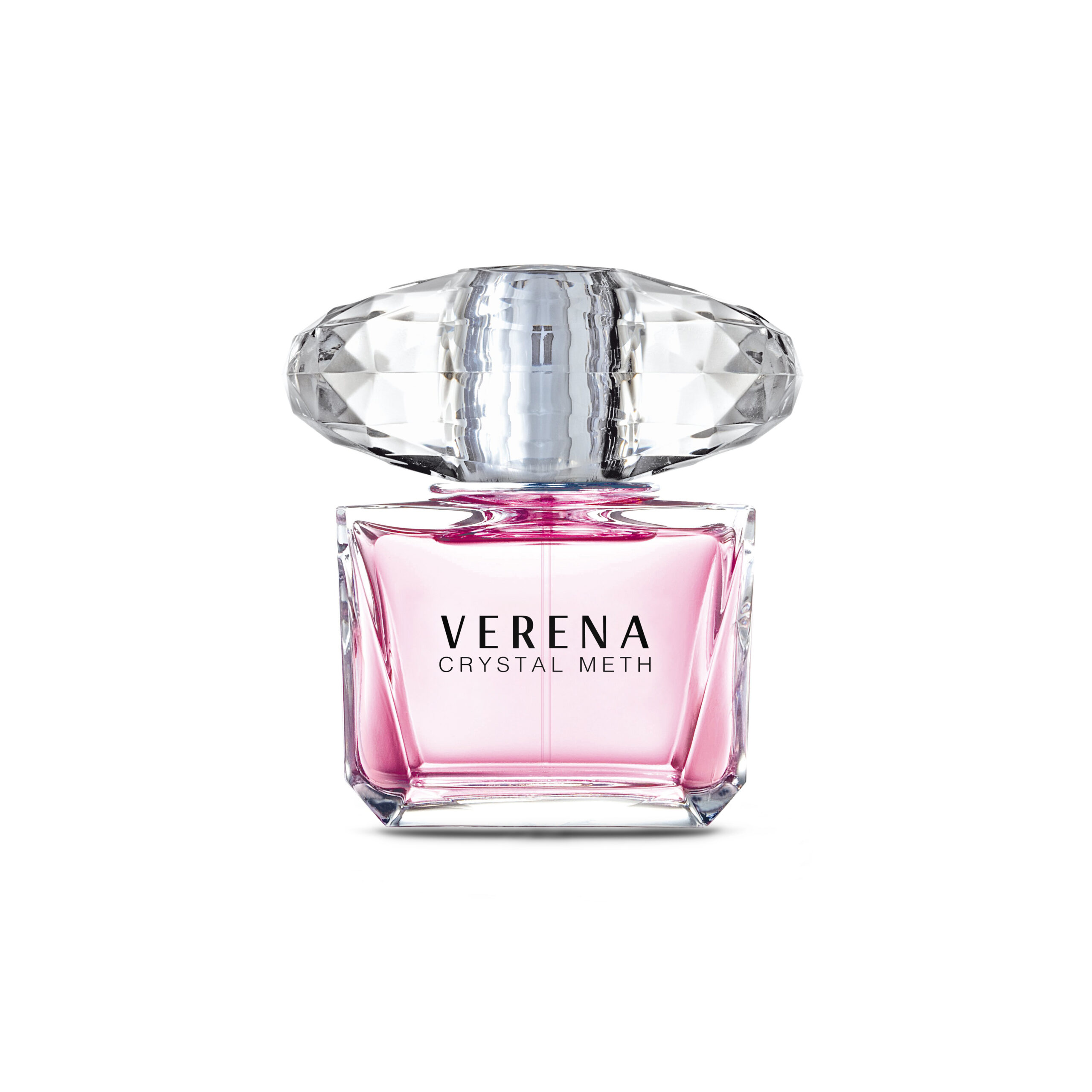
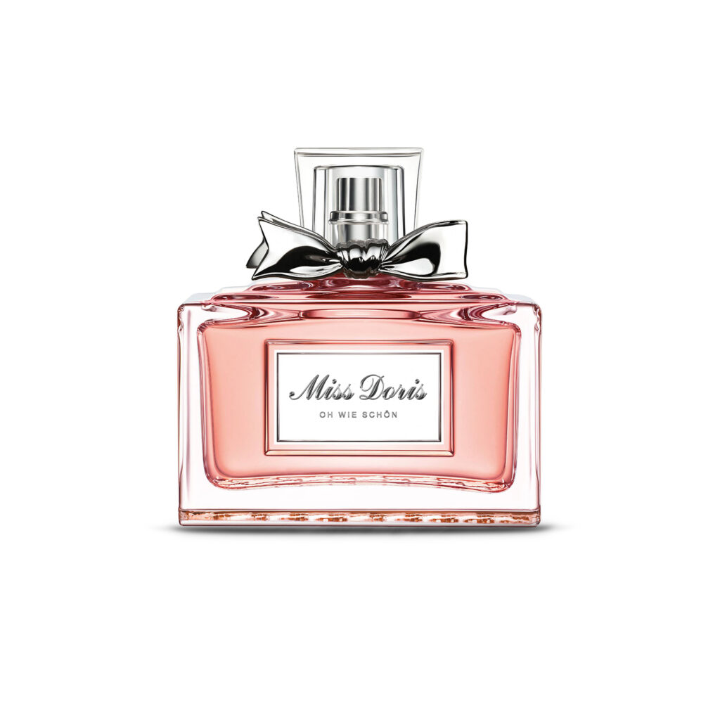
how much does a brand need to be recognized? and what is it that makes brands recognizable?
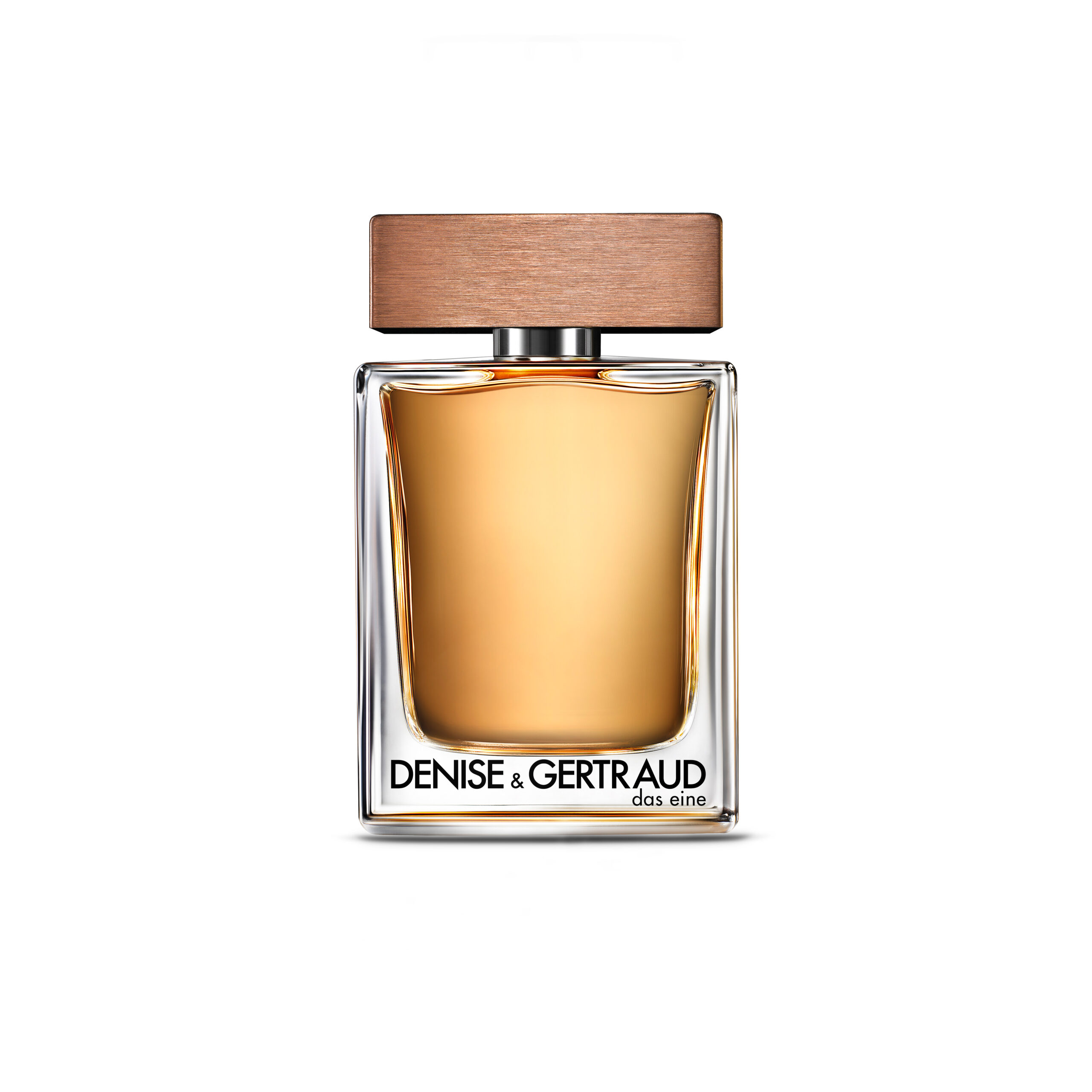
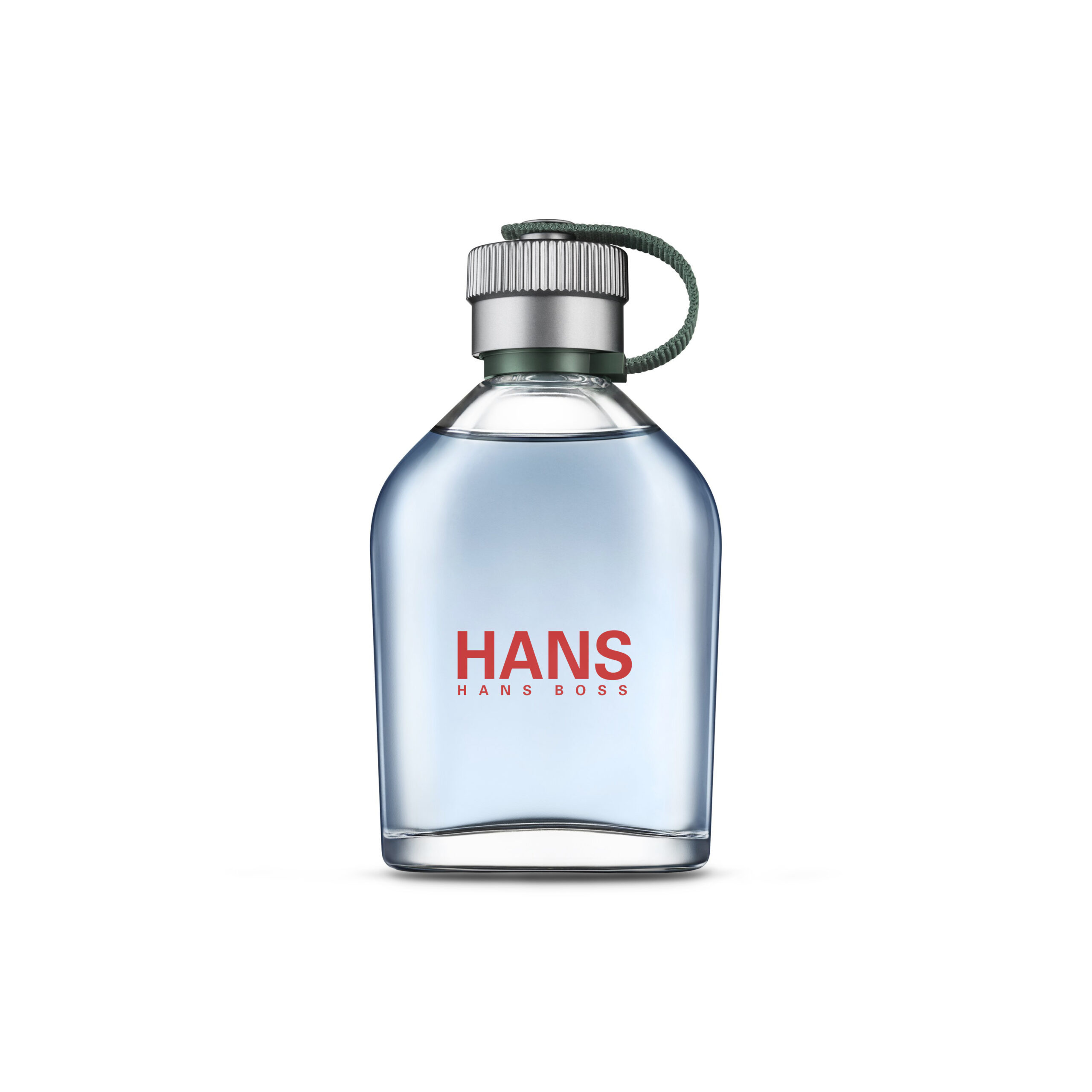
is it the color, the type, the logo, the name or maybe the combination of it all? can you guess the perfume brand? is the look, color and type font enough for you to recognize? did you even notice the difference? let me know if you like.
photography
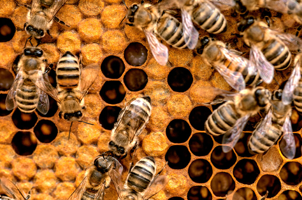
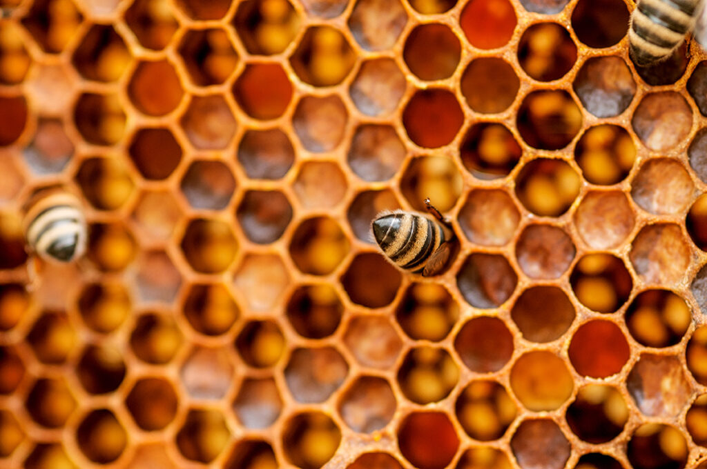
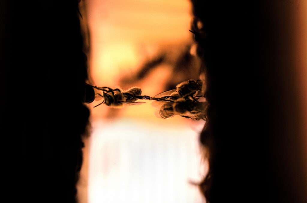
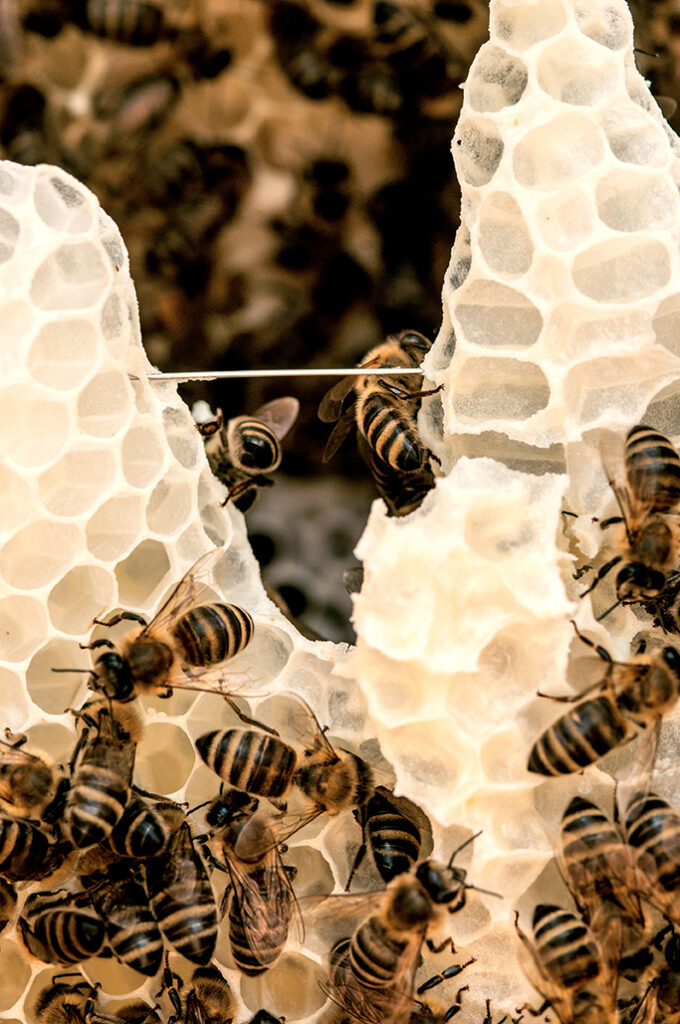
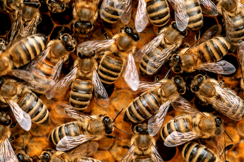
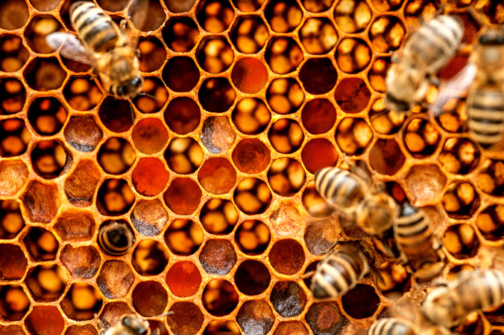
bees are one of the most important creatures on this planet earth. that’s why i wanted to get a closer look at them and capture their beauty. each and everyone of them has their individual reason and mission to be part of the hive. every honeycomb is a piece of art and the enlarged look shows the natural beauty of their perfection. sometimes the smallest things are the most important ones. bee aware!
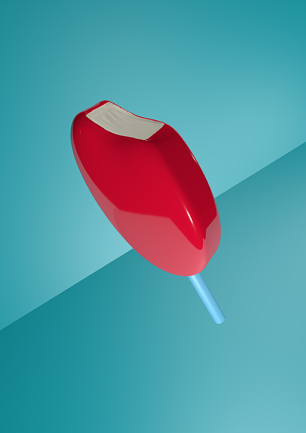
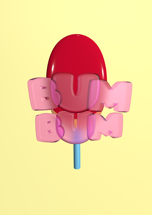
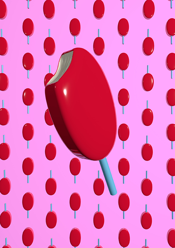
i always enjoy playing around with different ways to design and create. when designing a poster there are endless tools or aspects to create with. from illustration, type design, 3D design or just graphic shapes. each one can give a different meaning or effect.
for example these bumbum posters i made with cinema 4D, a software for 3D design.
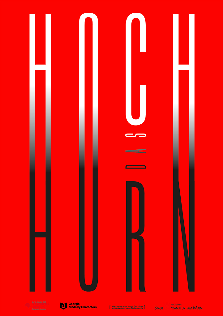
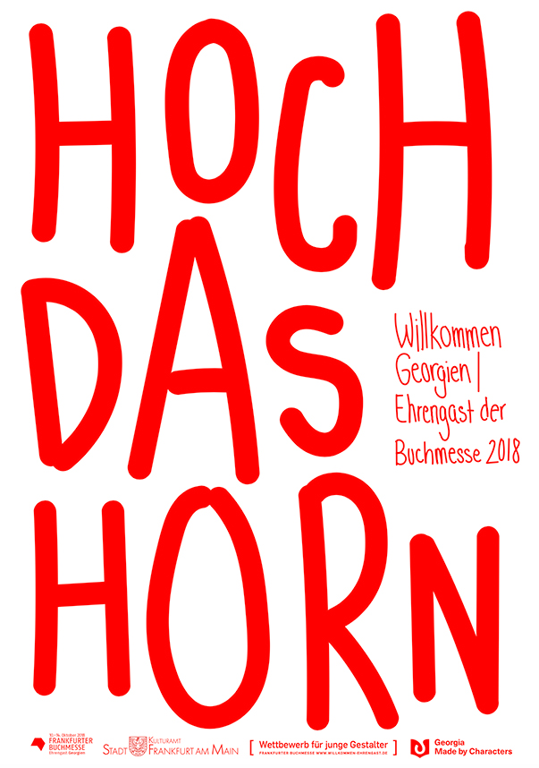
the type posters i designed for the poster competition of the Frankfurter Buchmesse, to welcome georgia to germany. trying out different types of type, graphic ones or just my own handwriting.
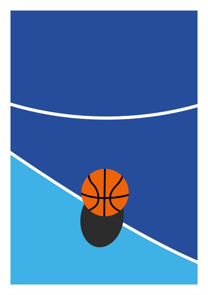
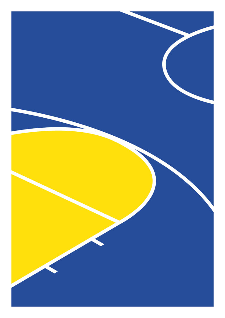
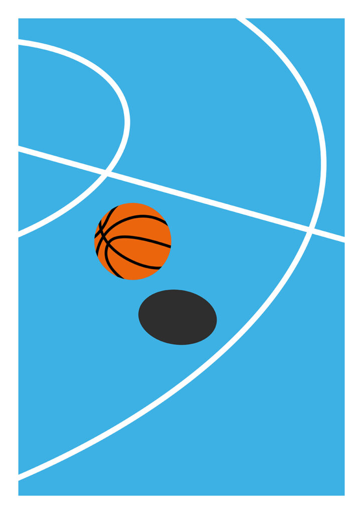
sport courts in general fascinate me with their simple shapes and lines.
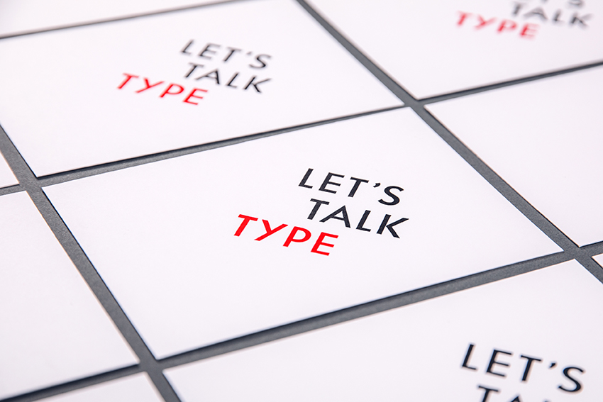
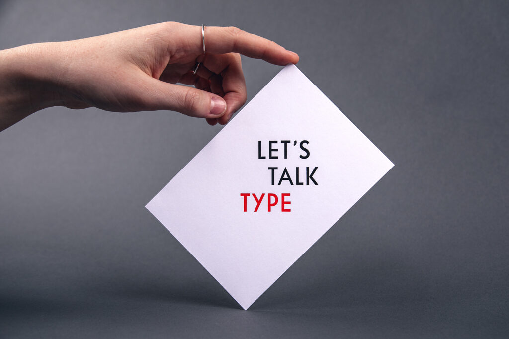
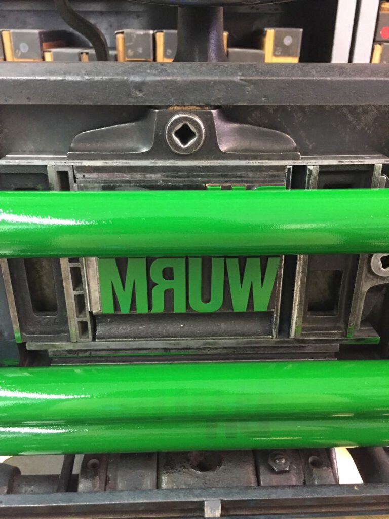
letterpress is not dead. at least not to me. i enjoy creating with my hands and being in the workshop. it balances out the whole sitting in front of a screen. and it shows you how printing first started. by hand.
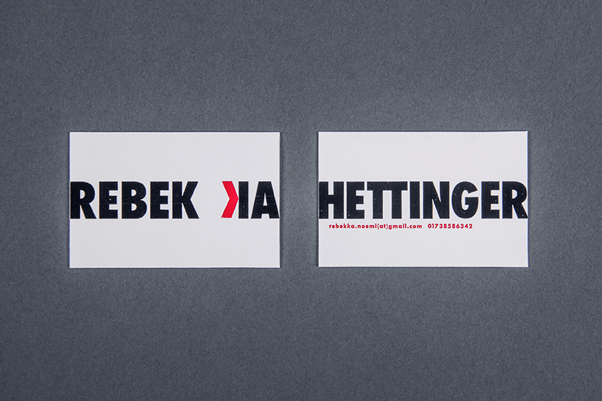
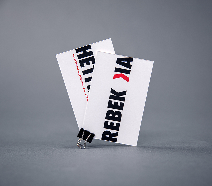
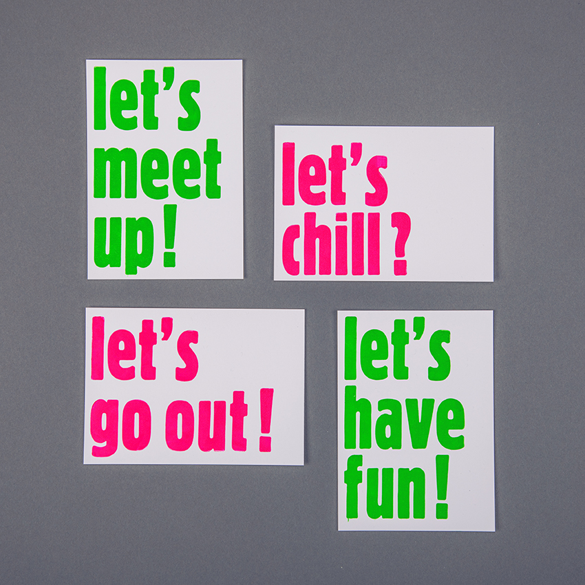
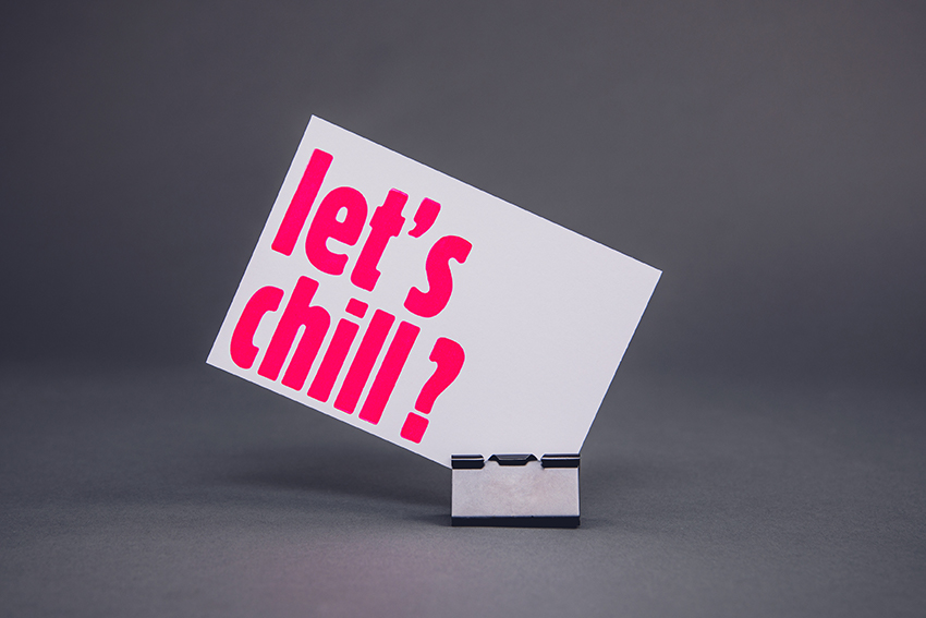
after a workshop in january 2017 at the Offizin Haag Durgulin in Dresden, my friend and i started to develop a great interest and affinity for letterpress.
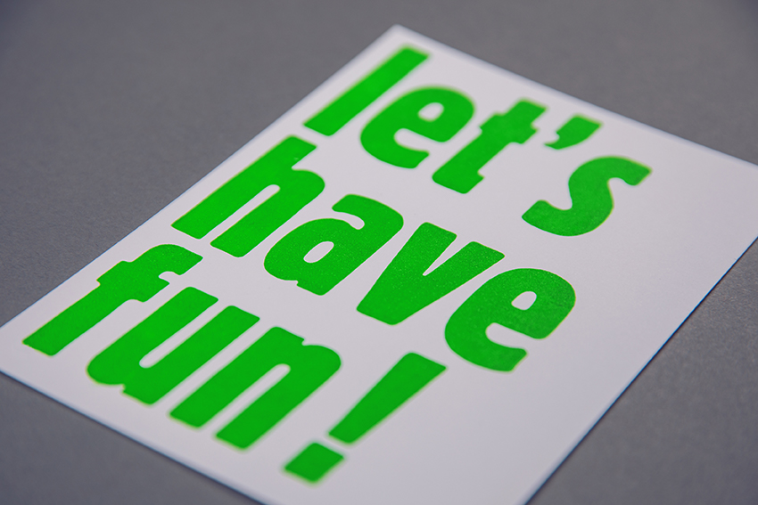
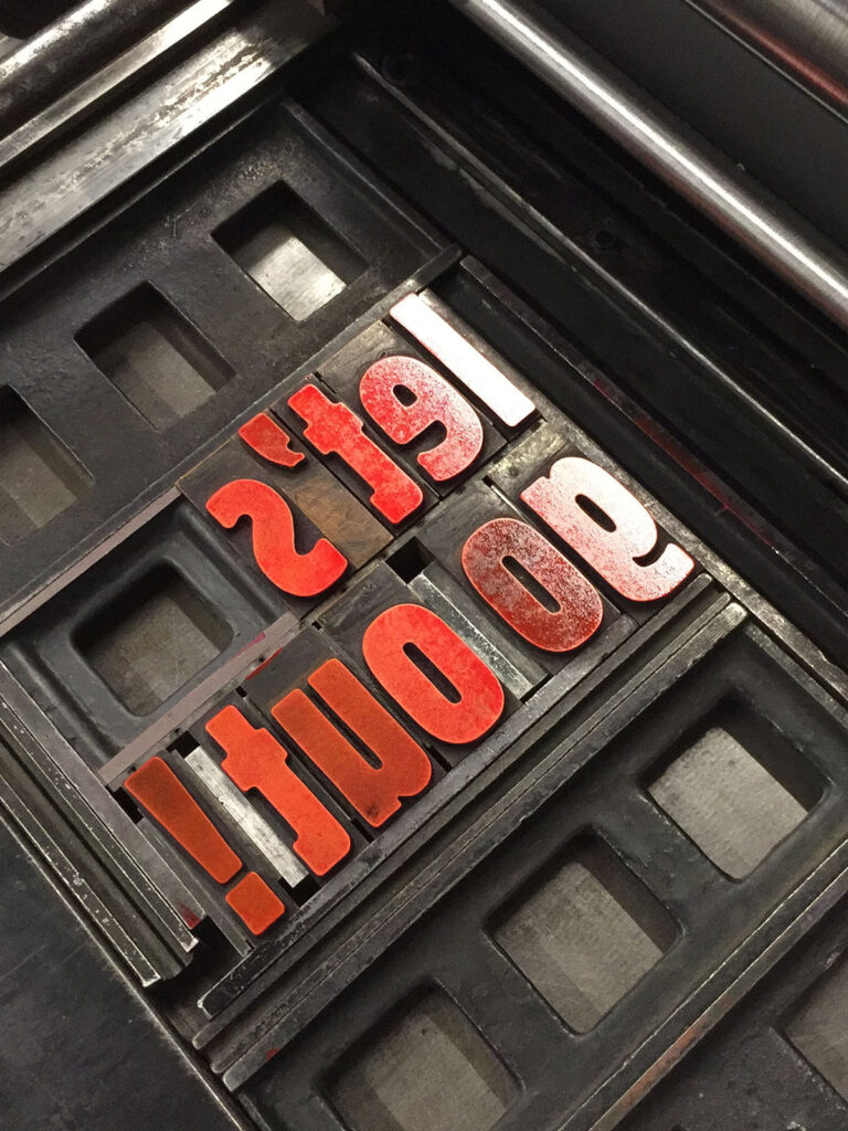
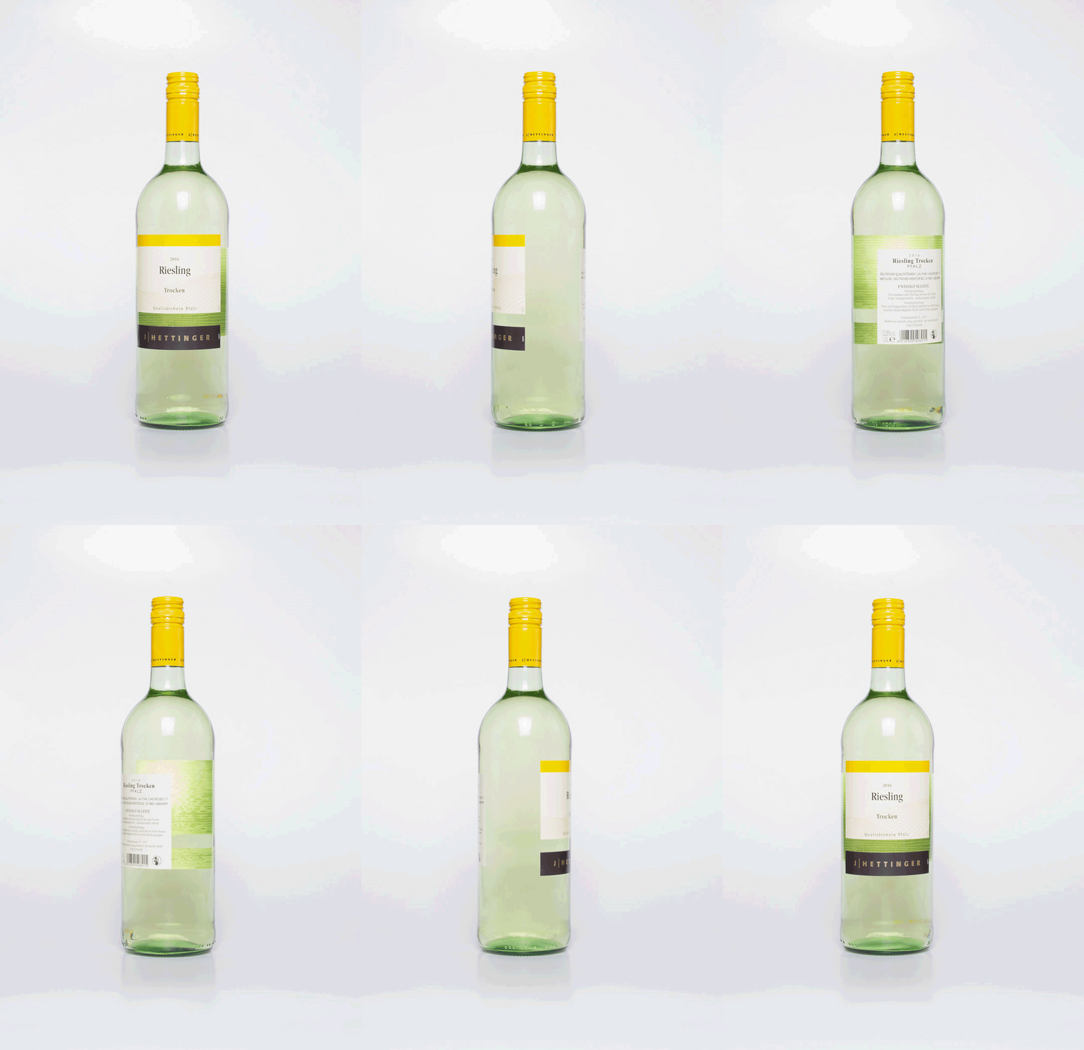
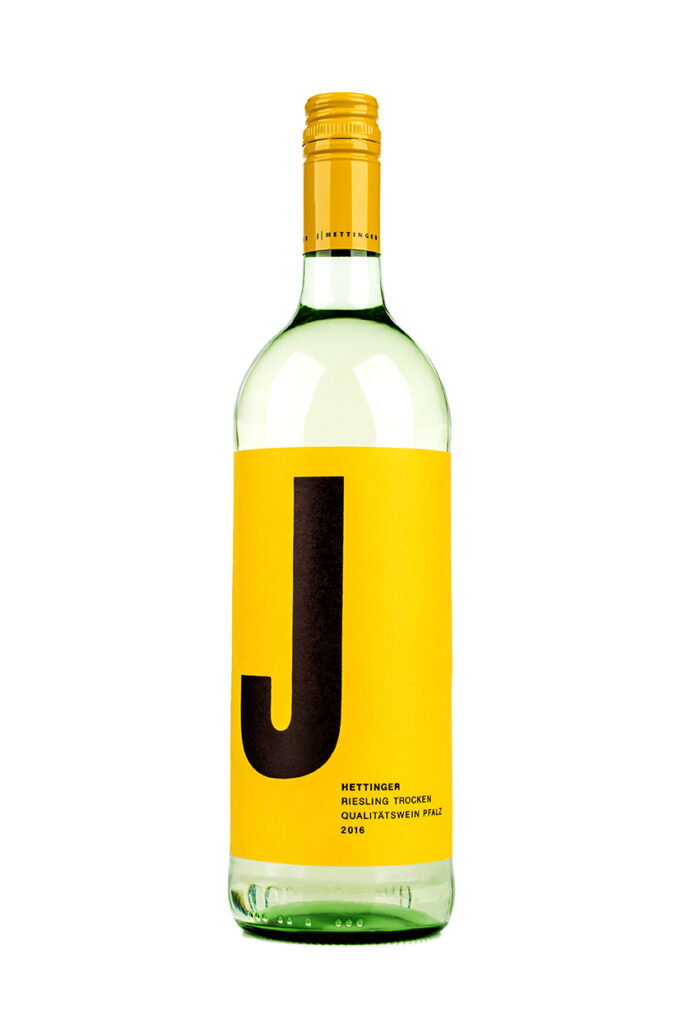
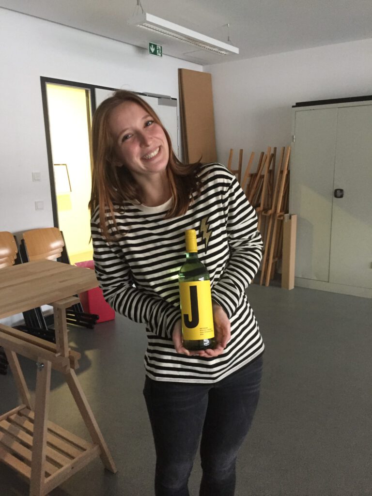
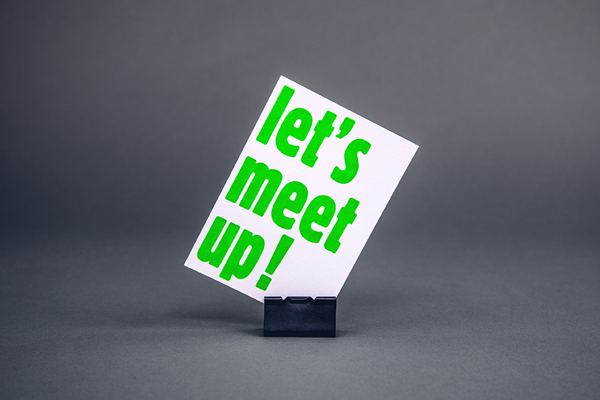
since then we have printed our own ideas and little projects in the letterpress workshop of the MD.H university.
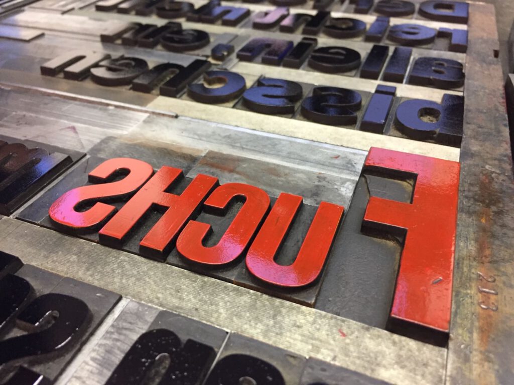
it varies from post cards, big posters, business cards to wine labels or christmas cards.
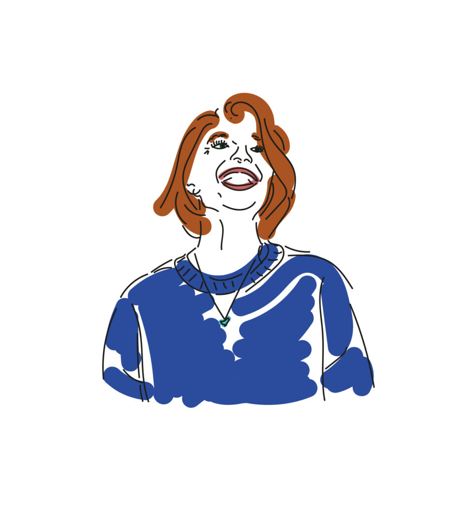
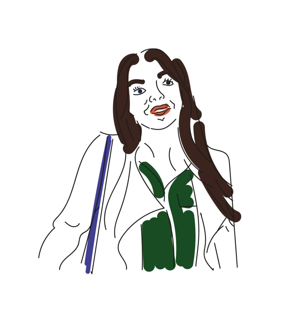
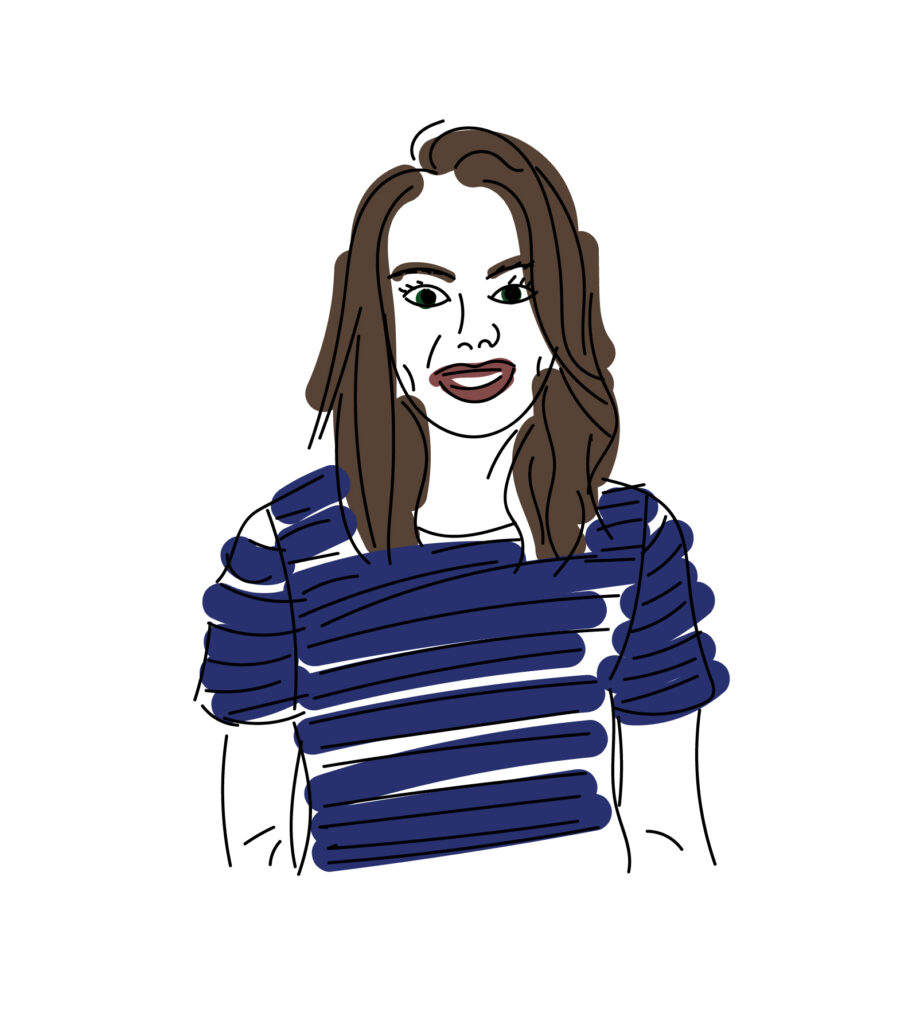
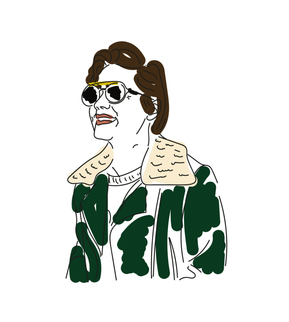
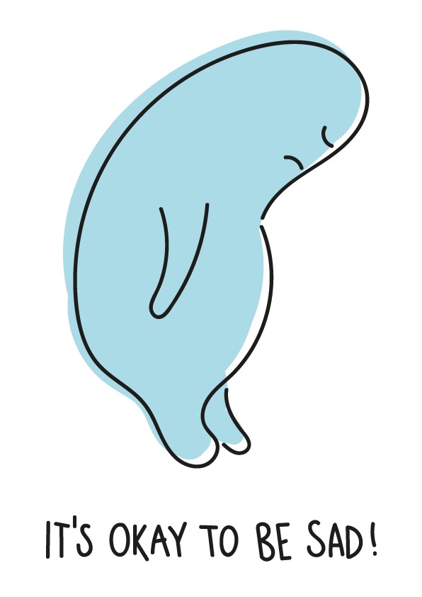
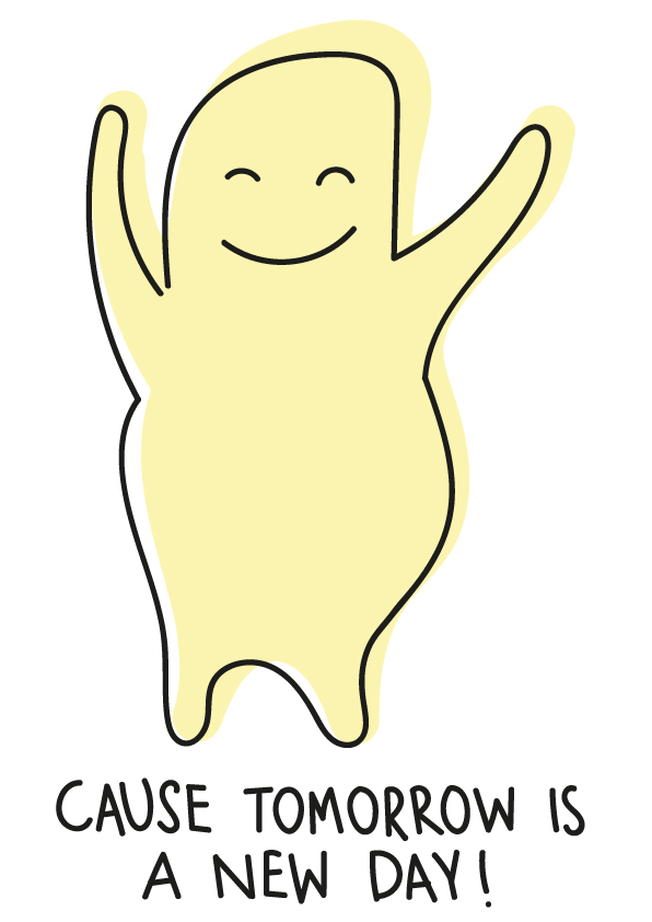
i started illustrating two years ago and realized quickly, that i have my own style. so every once in a while i illustrate something for a little card or a friend or just for fun.
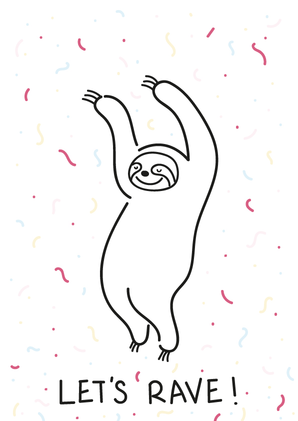
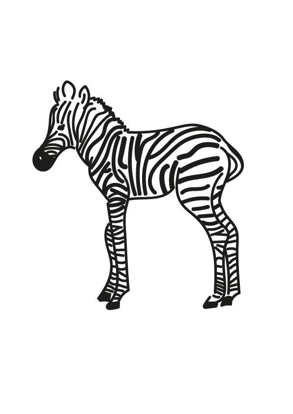
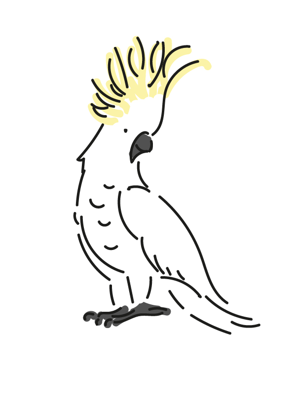
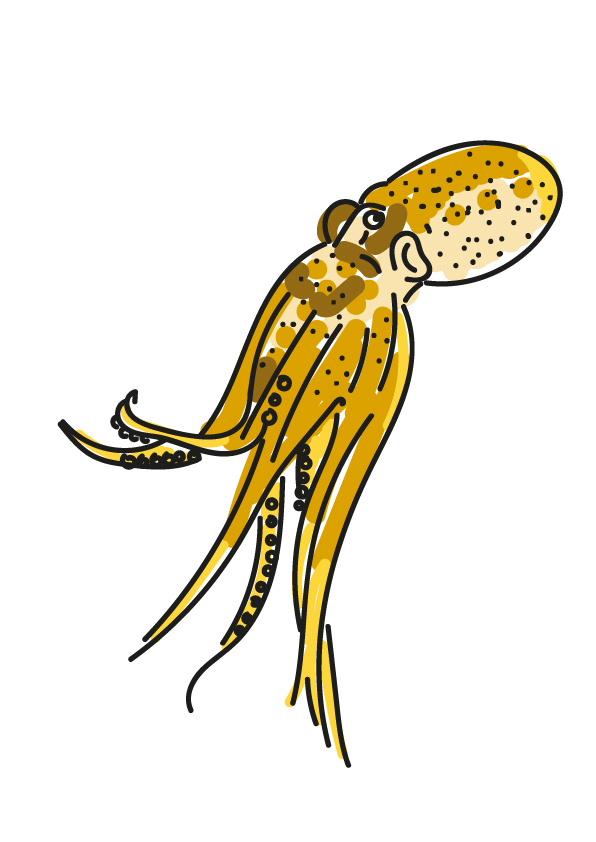
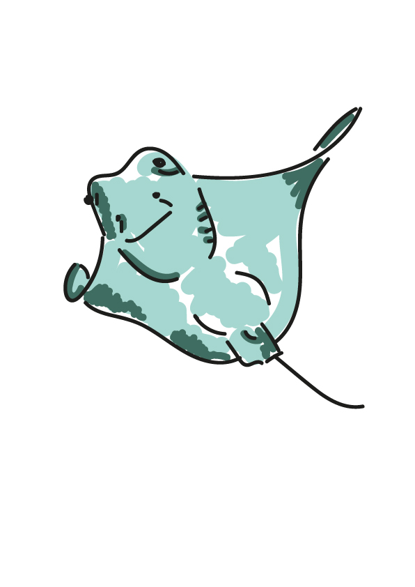
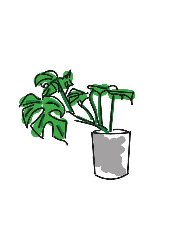
there are two big projects on my work page, where you can look at my illustrations in use. one app design (nosy) and one book (liebe gegen kummer). go and have a look to see my style in two completely different ways.
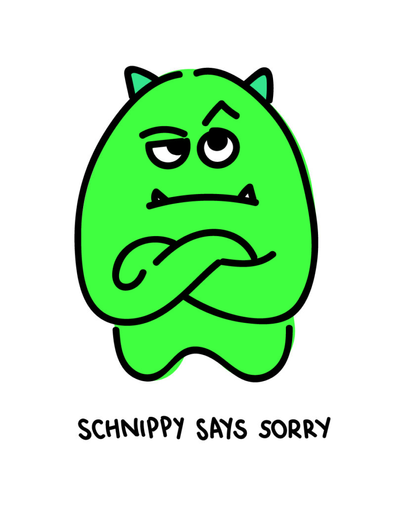
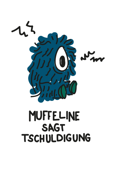
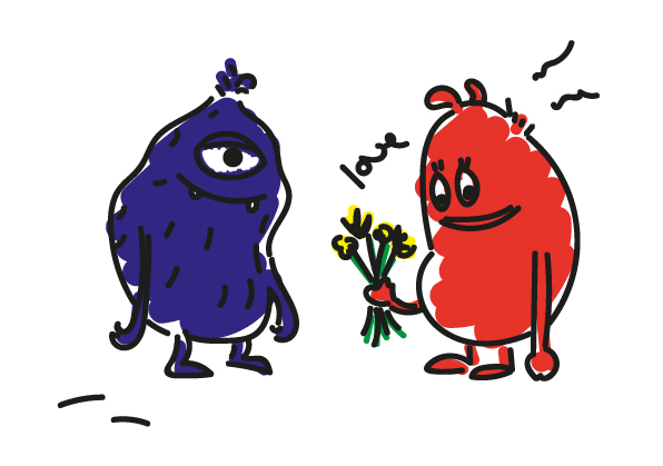
oh and also I am a big fan of little monsters. love to create them by illustrating and naming them. can you see they all have different moods?
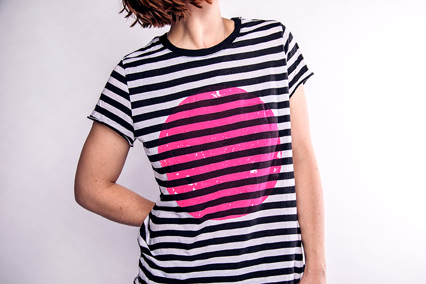
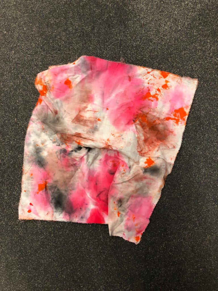
i love to explore new ways to create and design. silkscreen print is one of them. it first started with a single paper on a Boston Tiegel (letterpress machine). my friend and i used it to get rid of the redundant color on the machine.
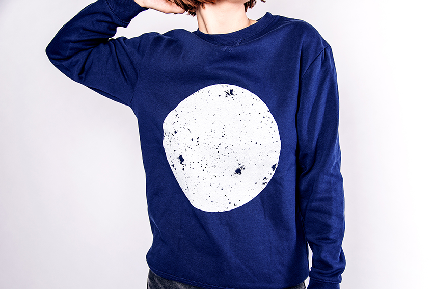
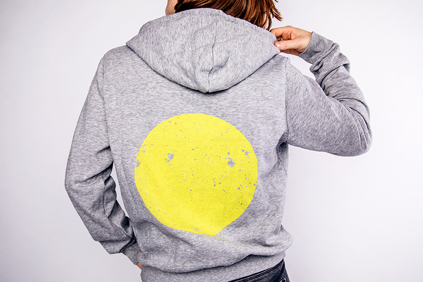
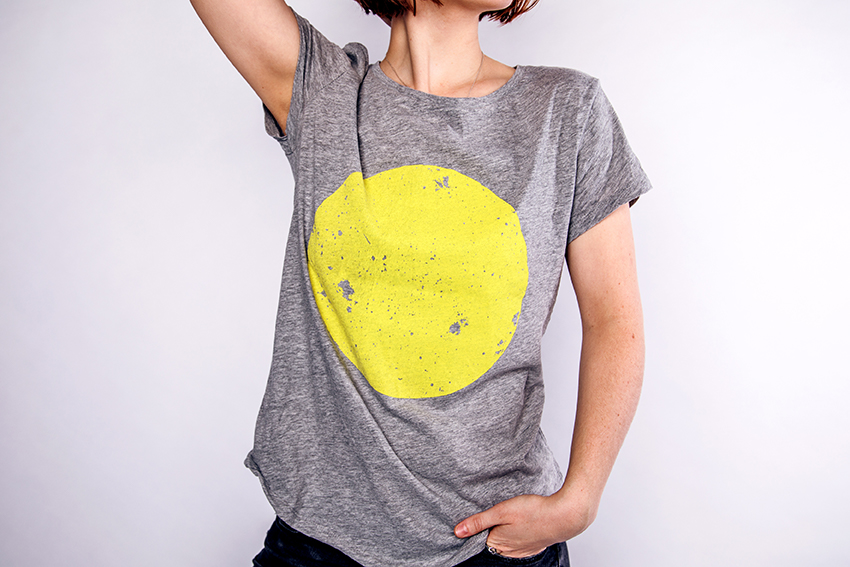
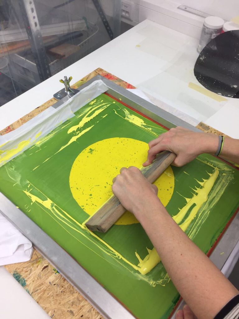
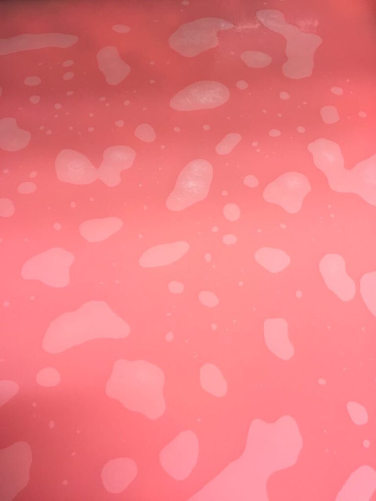
the result was this unique dot with structures in it. we decided to play around with it and created a collection of tees, sweatshirts and bags.
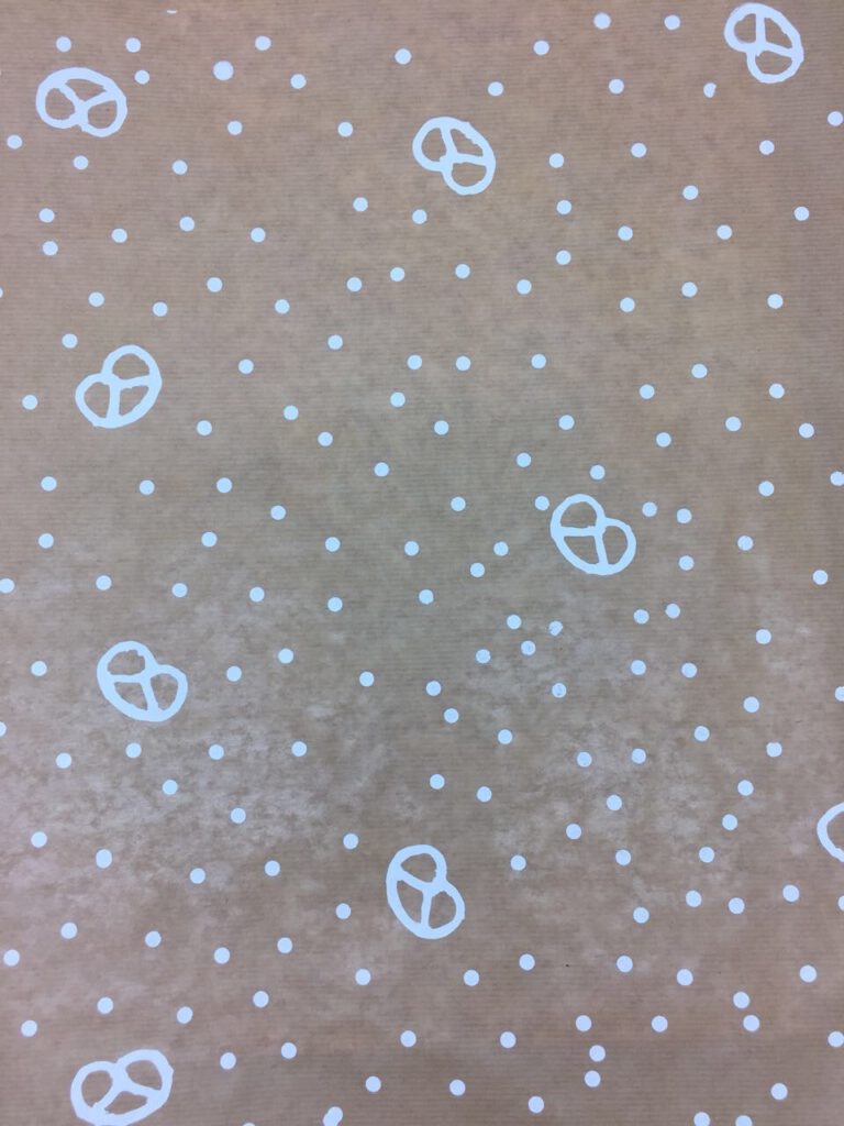
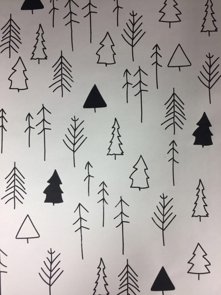
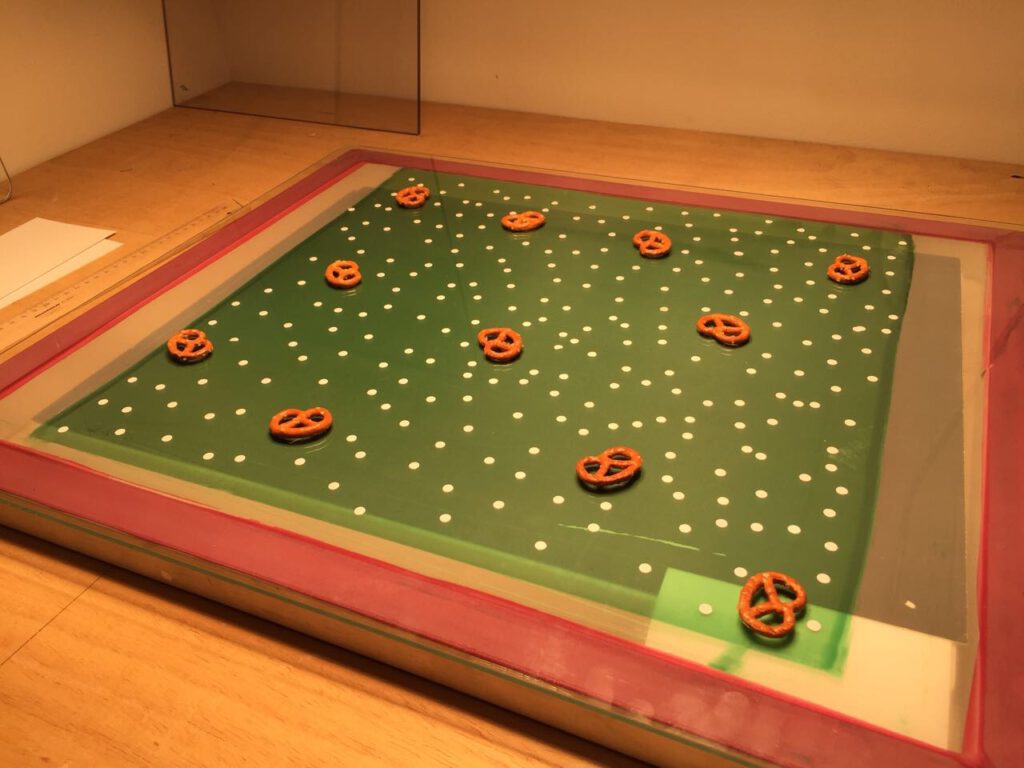
silkscreen print is just such a good way to freely create. we also did christmas cards, wrapping paper and other cool prints on clothes.